
Insight Blog
Agility’s perspectives on transforming the employee's experience throughout remote transformation using connected enterprise tools.
37 minutes reading time
(7494 words)
Understanding The Paynter Chart In Quality Management in 2026

Understanding The Paynter Chart In Quality Management in 2026
Learn how a Paynter Chart improves quality management, root cause analysis, and defect tracking. Includes Excel setup steps, templates, and real examples.
Understanding The Paynter Chart In Quality Management in 2026

Why do quality problems keep repeating even after teams believe they've solved them? It's a frustrating reality that affects manufacturers, service providers, and operational teams across almost every industry.
According to research from the American Society for Quality (ASQ), poor quality costs organisations an average of 15%–20% of annual sales revenue worldwide.
The real danger is that many businesses do not even realise how much time, money, and productivity are being lost because recurring defects are often hidden inside disconnected spreadsheets, outdated reports, and inconsistent tracking processes.
This is exactly where the Paynter Chart becomes valuable.
A Paynter Chart is a visual quality management tool designed to help organisations track recurring defects, identify root causes, monitor corrective actions, and spot patterns over time before they become larger operational problems.
Instead of reacting to issues after damage has already been done, teams can use structured trend analysis to uncover what keeps going wrong — and why.
20%
of annual revenue
According to research from the American Society for Quality (ASQ), poor quality management can cost organisations between 15%–20% of annual sales revenue worldwide due to recurring defects, operational inefficiencies, rework, and failed processes.
Source: American Society for Quality (ASQ)
Many automotive and manufacturing companies rely heavily on the Ford Paynter Chart methodology because it provides a clearer way to monitor defect recurrence, supplier quality issues, and continuous improvement efforts.
Ford helped popularise this approach by using structured defect tracking systems to improve visibility across production lines and quality assurance processes.
Today, the Ford Paynter Chart approach is still widely referenced in quality management environments where recurring failures can lead to financial loss, compliance risks, safety concerns, and customer dissatisfaction.
This article explores what a Paynter Chart is, how it works, why quality teams continue to rely on it, and how businesses can use Excel to build their own tracking system.
Readers will also discover real-world Paynter Chart examples, downloadable template ideas, and practical ways to improve root cause analysis using modern quality reporting methods.
Ask AI to explain this article
Use these AI tools to better understand this topic, simplify complex sections, generate examples, or ask follow-up questions based on what you are reading.


Key Takeaways
- A Paynter Chart helps organisations identify recurring defects, operational failures, and corrective action trends over time.
- The Ford Paynter Chart methodology became popular because it improved visibility into repeat issues, supplier defects, and long-term quality performance.
- Many businesses still rely on Paynter Chart in Excel templates to simplify defect tracking, root cause analysis, and quality reporting.
- Using structured Paynter Chart Examples makes it easier for teams to monitor recurring incidents and improve operational accountability.
- Modern quality management systems are evolving beyond spreadsheets by combining Paynter Chart reporting with AI analytics, dashboards, and predictive defect tracking.
What Is A Paynter Chart?
A Paynter Chart is a visual quality management tool used to track recurring defects, operational failures, and corrective actions over time.
Unlike basic reporting spreadsheets that only show isolated incidents, a Paynter Chart helps organisations identify patterns that continue repeating across departments, production lines, suppliers, or processes.
This makes it easier for quality teams to understand whether problems are actually being resolved — or simply reappearing in different forms weeks or months later.
The reason many businesses still rely on the Paynter Chart today is simple: recurring issues are expensive.
According to research from the American Society for Quality (ASQ), poor quality management can consume between 15% and 20% of annual sales revenue.
The biggest risk is not always the initial defect itself — it is the long-term operational damage caused when organisations fail to recognise repeat patterns early enough.
The Origin Of The Paynter Chart
The Paynter Chart became widely known in manufacturing and quality assurance environments where businesses needed a more structured way to monitor defects over time.
Traditional quality reports often showed what happened, but they struggled to show whether the same issue kept returning after corrective action had already been implemented.
This challenge became particularly important in large automotive manufacturing environments, which is why the Ford Paynter Chart methodology gained significant attention.
Ford used this structured tracking approach to monitor recurring production defects, supplier quality problems, and corrective action performance across complex manufacturing operations.
The Ford Paynter Chart approach focused heavily on trend visibility and accountability. Instead of simply recording failures, teams could track:
- recurring defect categories
- failed corrective actions
- supplier-related issues
- repeat incidents over time
- long-term quality improvement progress
This transformed the Paynter Chart into more than just a reporting tool — it became part of continuous improvement and root cause analysis processes.
How A Paynter Chart Works
A Paynter Chart organises operational or quality issues into structured categories and tracks them across specific time periods.
The goal is to make recurring patterns immediately visible so teams can prioritise corrective action before problems escalate.
Most Paynter Charts include:
- defect categories
- incident frequency
- time-based tracking
- root cause references
- corrective action status
- repeat occurrence indicators
For example, a manufacturing business may track:
- supplier defects
- damaged products
- machine downtime
- packaging failures
- customer complaints
Over several weeks or months, the Paynter Chart helps reveal which issues continue repeating despite intervention efforts.
This is one reason why many Paynter Chart Examples are used heavily in manufacturing, healthcare, workplace safety, and service management environments where repeated operational failures create financial risk.
Paynter Chart vs Other Quality Charts
Many people confuse a Paynter Chart with other quality management tools, but they serve different purposes.
A Pareto Chart helps teams identify the biggest problems based on frequency or impact. It answers the question:
"What issue causes the most disruption?"
A Control Chart focuses on process stability and statistical variation over time. It helps teams determine whether a process is operating within acceptable limits.
A Paynter Chart goes further by tracking recurring issues and corrective action effectiveness over longer periods. Instead of simply highlighting a problem once, it helps organisations identify whether the same issue continues returning after teams believed it had already been resolved.
This is why many Ford Paynter Chart systems became highly valuable in manufacturing environments where recurring defects could lead to warranty claims, compliance failures, safety risks, and production delays.
Why Quality Teams Use Paynter Charts
Modern quality teams use the Paynter Chart because it improves visibility across operational processes that are often fragmented across spreadsheets, reports, and disconnected systems.
A well-structured Paynter Chart can help organisations:
- identify recurring defects faster
- monitor corrective action effectiveness
- improve supplier accountability
- reduce repeated operational failures
- improve cross-team visibility
- support root cause analysis initiatives
- strengthen continuous improvement programs
Many businesses also rely on Paynter Chart Examples during audits, compliance reviews, and operational investigations because they provide a clearer historical view of how issues evolved over time.
Without a structured quality tracking system, organisations often fall into a dangerous cycle where the same problems continue repeating while teams incorrectly assume corrective actions were successful.
Ford Paynter Chart Methodology Explained
The Ford Paynter Chart methodology became widely recognised because it solved a major problem that many manufacturing businesses struggled to control: recurring defects that continued appearing even after corrective actions had supposedly been completed.
In large-scale manufacturing environments, especially automotive production, repeated quality failures can create enormous financial losses, production delays, warranty claims, compliance risks, and reputational damage.
This is why Ford invested heavily in structured quality reporting systems that made recurring operational issues easier to identify and monitor over time.
Instead of relying on disconnected spreadsheets or isolated incident reports, the Ford Paynter Chart approach provided a more visual and data-driven way to track quality trends, recurring defects, and corrective action effectiveness across manufacturing operations.
Today, many organisations still reference the Ford Paynter Chart methodology because the same operational challenges continue to exist across manufacturing, healthcare, logistics, workplace safety, and service industries.
Why Ford Popularised The Paynter Chart
Ford helped popularise the Paynter Chart because traditional reporting methods often failed to reveal long-term patterns.
Teams could record defects and close corrective actions, but there was limited visibility into whether the same problems continued reappearing months later.
This created a dangerous cycle where businesses believed issues had been resolved while operational failures quietly continued underneath the surface.
The Ford Paynter Chart introduced a more structured way to:
- track recurring defect categories
- monitor repeat incidents
- review corrective action performance
- improve supplier accountability
- identify long-term operational trends
- strengthen root cause analysis processes
This became especially important in automotive manufacturing environments where even small recurring defects could impact thousands of vehicles and create significant recall costs.
According to research from the American Society for Quality (ASQ), poor quality management can consume between 15% and 20% of annual sales revenue. For large manufacturers, recurring defects are not simply operational annoyances — they can quickly become major financial and compliance risks.
The psychological challenge many organisations face is that repeated problems often become normalised over time. Teams adapt to recurring issues instead of solving the underlying cause.
The Ford Paynter Chart methodology was designed to expose these hidden patterns before they escalated into larger operational failures.
Key Elements In A Ford Paynter Chart
A Ford Paynter Chart is built around structured trend visibility.
The goal is not simply to log defects, but to create a historical view that helps quality teams recognise recurring operational behaviour over time.
Most Ford Paynter Chart systems include several core elements.
Defect Categories
Issues are grouped into clearly defined categories so recurring problems can be tracked consistently.
Examples may include:
- assembly defects
- supplier quality failures
- equipment downtime
- packaging damage
- compliance incidents
- customer complaints
Without structured categories, businesses often struggle to identify long-term trends because data becomes inconsistent across departments.
Time Tracking
Time visibility is one of the most important components of a Paynter Chart.
Issues are tracked weekly, monthly, or quarterly to reveal whether problems continue repeating after corrective action has been introduced.
This allows quality teams to identify:
- recurring seasonal issues
- production cycle failures
- ongoing supplier problems
- unresolved operational weaknesses
Corrective Actions
The Ford Paynter Chart methodology focuses heavily on corrective action monitoring. Many businesses document corrective actions but fail to verify whether they actually solved the issue.
Tracking corrective action status helps organisations:
- measure effectiveness
- identify failed interventions
- improve accountability
- prevent repeated operational mistakes
Responsibility Ownership
One reason quality initiatives fail is because ownership becomes unclear across departments.
Ford Paynter Chart systems often assign accountability to specific teams, suppliers, or operational leaders.
This improves visibility around:
- who owns the issue
- who implemented corrective actions
- whether actions were completed
- where escalation is required
Repeat Incident Monitoring
Perhaps the most valuable part of the Ford Paynter Chart is its ability to expose repeat incidents that would otherwise remain hidden inside disconnected reporting systems.
Instead of viewing defects as isolated events, organisations can identify:
- recurring root causes
- failed process improvements
- repeat supplier failures
- unresolved operational risks
This creates a far more proactive approach to quality management.
Lessons Modern Businesses Can Learn From Ford Paynter Charts
Although the Ford Paynter Chart originated in manufacturing environments, the principles behind it remain highly relevant for modern organisations across almost every industry.
Many businesses still struggle with fragmented reporting systems, inconsistent operational visibility, and recurring issues hidden across spreadsheets, emails, and disconnected software platforms.
The biggest lesson from the Ford Paynter Chart methodology is that trend visibility matters more than isolated reporting.
Why Trend Visibility Matters
A single defect rarely causes major operational damage on its own. The real risk comes when the same issue continues repeating unnoticed over long periods.
Without structured trend visibility:
- businesses repeat the same mistakes
- corrective actions become ineffective
- teams lose accountability
- operational waste increases
- customer trust declines
The Paynter Chart helps expose these patterns before they become financially damaging.
Importance Of Structured Quality Reporting
Many organisations collect operational data, but very few structure it effectively.
The Ford Paynter Chart approach demonstrates why consistent reporting frameworks are critical for long-term quality improvement.
Structured reporting helps businesses:
- compare trends over time
- standardise defect tracking
- improve audit readiness
- strengthen compliance reporting
- improve decision-making accuracy
Building A Continuous Improvement Culture
One of the biggest psychological shifts behind the Ford Paynter Chart methodology is moving organisations away from reactive problem solving toward continuous improvement.
Instead of waiting for major failures to occur, businesses can continuously monitor patterns, improve processes, and refine corrective actions over time.
This creates a culture where quality management becomes proactive rather than reactive — which is ultimately why the Paynter Chart remains valuable decades after it was first introduced.
Paynter Chart Examples For Quality Management
Manufacturing Paynter Chart Example
A manufacturing Paynter Chart is commonly used to track recurring production defects, supplier quality issues, equipment downtime, and assembly failures across production lines.
Instead of treating each incident as an isolated problem, manufacturers use a Paynter Chart in Excel to monitor recurring patterns over weeks or months.
This helps quality teams identify whether corrective actions are actually reducing defects or if the same operational problems continue repeating.
Many businesses also rely on a paynter chart template free download to standardise defect reporting across departments and suppliers.
Healthcare Paynter Chart Example
In healthcare environments, a Paynter Chart helps organisations track patient safety incidents, compliance failures, medication errors, and operational process breakdowns.
Hospitals and healthcare providers often manage large amounts of incident data, making it difficult to identify recurring risks without structured reporting.
A paynter chart pdf is frequently used during audits and compliance reviews because it provides a visual history of recurring operational failures and corrective actions.
Many healthcare organisations also use paynter chart free templates to simplify incident monitoring and improve regulatory reporting processes.
IT & Service Desk Paynter Chart Example
IT teams and service desks use Paynter Chart Examples to track recurring support tickets, system outages, cybersecurity incidents, and root cause escalation patterns.
When the same technical problems continue reappearing, businesses can quickly lose productivity and customer trust.
A Paynter Chart in Excel allows IT teams to organise incidents by category, monitor recurring failures, and identify which corrective actions are ineffective.
Many organisations start with a paynter chart template free resource before building more advanced reporting dashboards for long-term operational analysis.
Workplace Health & Safety Paynter Chart Example
A workplace health and safety Paynter Chart is often used to monitor recurring hazards, near misses, equipment safety failures, and incident trends across operational sites.
This helps businesses identify whether safety risks continue repeating after corrective action has been introduced.
Many organisations use paynter chart free templates to improve incident visibility and support compliance reporting during audits or investigations.
A paynter chart pdf can also help safety teams share historical incident trends with management, regulators, and operational leaders more effectively.
The Benefits Of Using A Paynter Chart
Many organisations believe they have solved operational problems simply because a corrective action was logged or an incident was closed. The reality is often very different.
According to the American Society for Quality (ASQ), poor quality management can consume between 15% and 20% of annual sales revenue due to recurring defects, operational inefficiencies, and process failures.
This is exactly why the Paynter Chart remains valuable in modern quality management.
It gives businesses a clearer way to monitor recurring issues, improve process transparency, and identify patterns hidden inside disconnected spreadsheets and reporting systems.
Better Root Cause Visibility
One of the biggest advantages of a Paynter Chart is improved root cause visibility.
Many businesses focus only on individual incidents without recognising the deeper operational patterns causing repeated failures.
A Paynter Chart helps teams connect recurring issues across departments, suppliers, processes, and production cycles.
Instead of reacting to isolated incidents, organisations can identify long-term operational weaknesses that continue generating the same problems.
This improves:
- root cause analysis
- defect trend tracking
- operational transparency
- quality reporting accuracy
- process improvement visibility
For example, a manufacturing business may discover that multiple product defects all trace back to the same supplier issue or production bottleneck.
Without structured trend analysis, these patterns often remain hidden for months.
Faster Corrective Action Tracking
Many organisations struggle with corrective action management because there is limited visibility into whether actions were actually completed or effective.
Teams often document fixes, close reports, and move on — only for the same issue to return later.
A Paynter Chart improves corrective action tracking by showing:
- recurring incidents over time
- failed corrective actions
- unresolved operational risks
- repeat defect categories
- escalation patterns
This creates stronger accountability across quality management teams and helps businesses avoid repeating the same operational mistakes.
Using a Paynter Chart in Excel also allows organisations to monitor corrective action status in a simple and structured format without relying on multiple disconnected systems.
Improved Trend Analysis
Trend visibility is one of the most powerful features of a Paynter Chart.
Businesses generate large amounts of operational data every day, but most organisations struggle to turn that data into actionable insight.
A Paynter Chart helps visualise:
- recurring defect patterns
- seasonal operational issues
- supplier quality trends
- workplace incident frequency
- long-term process failures
This makes it easier for teams to identify whether operational performance is improving or quietly getting worse over time.
Many Paynter Chart Examples are used specifically for long-term quality trend analysis because visual reporting makes recurring problems easier to recognise compared to static spreadsheets or isolated incident logs.
Reduced Repeat Defects
One of the biggest hidden costs inside operational environments is repeated defects.
Businesses often waste significant time and money fixing the same problems repeatedly because there is no clear visibility into recurring issues.
A Paynter Chart helps reduce repeat defects by improving:
- quality control monitoring
- operational consistency
- corrective action follow-up
- supplier accountability
- continuous improvement processes
This is particularly important in industries where recurring failures can create compliance risks, safety issues, or customer dissatisfaction.
The psychological challenge many businesses face is that recurring problems slowly become accepted as "normal operational behaviour."
A Paynter Chart helps expose these patterns before they become deeply embedded inside company processes.
Stronger Cross-Department Accountability
Many operational failures occur because information is fragmented across departments, spreadsheets, and disconnected reporting tools.
One team may identify a problem while another team owns the corrective action, creating communication gaps and poor accountability.
A Paynter Chart improves cross-department visibility by centralising:
- incident tracking
- defect categories
- ownership responsibilities
- corrective action progress
- operational trend reporting
This helps teams work from the same data instead of relying on fragmented updates or manual reporting processes.
Better process transparency also improves:
- compliance reporting
- audit readiness
- supplier management
- operational communication
- quality management consistency
Without structured visibility, organisations often lose track of recurring operational risks until they escalate into much larger financial or compliance problems.
Common Problems Teams Face Without A Paynter Chart
Many organisations believe they have strong quality management processes in place, but the reality often looks very different behind the scenes.
Without a structured Paynter Chart, businesses struggle to identify recurring defects, monitor corrective actions, and track long-term operational trends effectively.
This creates a dangerous situation where the same operational failures continue repeating while teams assume problems have already been resolved.
Over time, these hidden inefficiencies lead to rising operational costs, compliance risks, customer dissatisfaction, and reduced process visibility.
Repeating The Same Quality Mistakes
One of the biggest problems businesses face without a Paynter Chart is repeated operational mistakes.
Teams may resolve an issue temporarily, but without proper trend analysis, the same defect often returns weeks or months later.
This happens because many organisations only focus on individual incidents rather than recurring operational patterns.
Common examples include:
- repeated supplier defects
- recurring machine downtime
- repeated customer complaints
- ongoing workplace safety incidents
- repeated compliance failures
A Paynter Chart helps businesses identify recurring trends early before they become deeply embedded into daily operations.
Without proper visibility:
- corrective actions become reactive
- root causes remain unresolved
- operational waste increases
- productivity continues declining
This is one reason why many businesses now rely on Paynter Chart Examples and structured quality reporting systems to improve operational consistency.
Poor Corrective Action Follow-Up
Many businesses document corrective actions but fail to properly monitor whether those actions actually solved the problem.
This creates a false sense of progress where incidents are marked as completed even though the underlying issue still exists.
Without structured tracking, organisations often struggle with:
- incomplete corrective actions
- poor accountability
- inconsistent follow-up processes
- repeated escalation issues
- unresolved operational risks
A Paynter Chart improves corrective action visibility by tracking recurring incidents over time instead of treating problems as isolated events.
This is especially important in industries such as:
- manufacturing
- healthcare
- workplace safety
- logistics
- quality assurance
When corrective action management is weak, businesses often spend significant time fixing the same problems repeatedly instead of improving long-term operational performance.
Disconnected Reporting Systems
Many organisations still manage operational reporting across spreadsheets, emails, shared drives, and disconnected software platforms.
This fragmented approach makes it difficult to identify recurring quality issues across teams and departments.
Disconnected reporting systems often create:
- duplicate records
- inconsistent data
- missing incident history
- delayed reporting
- poor cross-team visibility
A Paynter Chart centralises operational trend analysis into a structured format that improves visibility across the organisation.
This helps businesses:
- standardise defect tracking
- improve quality reporting
- strengthen audit readiness
- simplify operational reviews
- improve root cause analysis
Without connected reporting systems, operational data becomes difficult to trust, making long-term quality improvement far more challenging.
Spreadsheet Chaos & Manual Tracking
Many quality teams still rely heavily on manual spreadsheets to track incidents, defects, and corrective actions. While spreadsheets may work initially, they often become difficult to manage as operational complexity increases.
Over time, spreadsheet-based tracking creates:
- version control problems
- missing historical data
- manual reporting errors
- inconsistent formatting
- limited trend visibility
A Paynter Chart in Excel can improve structure significantly compared to basic spreadsheets because it focuses on recurring trend analysis rather than isolated data collection.
However, many organisations eventually outgrow manual tracking systems entirely as reporting requirements become more complex.
The psychological problem with spreadsheet chaos is that businesses often believe they have visibility simply because data exists somewhere. In reality, disconnected spreadsheets make recurring operational risks harder to identify.
Lack Of Historical Defect Visibility
One of the most damaging problems without a Paynter Chart is the inability to track long-term defect history properly. Businesses may record incidents individually, but they often struggle to identify whether the same problems continue repeating over months or years.
Without historical visibility, organisations cannot effectively:
- identify recurring defects
- measure improvement progress
- track failed corrective actions
- monitor operational trends
- improve continuous improvement initiatives
This lack of visibility often causes businesses to underestimate how much operational waste is being created by recurring issues.
A structured Paynter Chart helps organisations build a clearer historical view of operational performance, making it easier to recognise patterns, improve accountability, and reduce repeated failures over time.
How To Create A Paynter Chart In Excel

How To Create A Paynter Chart In Excel
Creating a Paynter Chart in Excel is one of the simplest ways to improve quality tracking, defect analysis, and corrective action visibility without investing in expensive quality management software.
Many businesses still use Excel because it is flexible, familiar, and easy to customise for operational reporting.
The goal of a Paynter Chart is not just to collect data — it is to identify recurring problems, monitor trends, and expose operational weaknesses before they become larger business risks.
Example Paynter Chart In Excel
This embedded Paynter Chart example shows how quality teams can track recurring defects, corrective actions, and operational trends over time using a simple Excel-style layout.
| Month | Defect Category | Root Cause | Corrective Action | Status | Repeat Issue |
|---|---|---|---|---|---|
| January | Packaging Damage | Supplier Material Fault | Changed Supplier Packaging | Monitoring | Yes |
| February | Machine Downtime | Overheating Motor | Preventive Maintenance Added | Resolved | No |
| March | Customer Complaints | Delayed Shipping | Updated Logistics Workflow | Monitoring | Yes |
| April | Safety Incident | Missing PPE Checks | Daily Inspection Introduced | Resolved | No |
| May | Supplier Defect | Incorrect Component Size | Supplier Audit Scheduled | Open | Yes |
Step 1 — Define Your Defect Categories
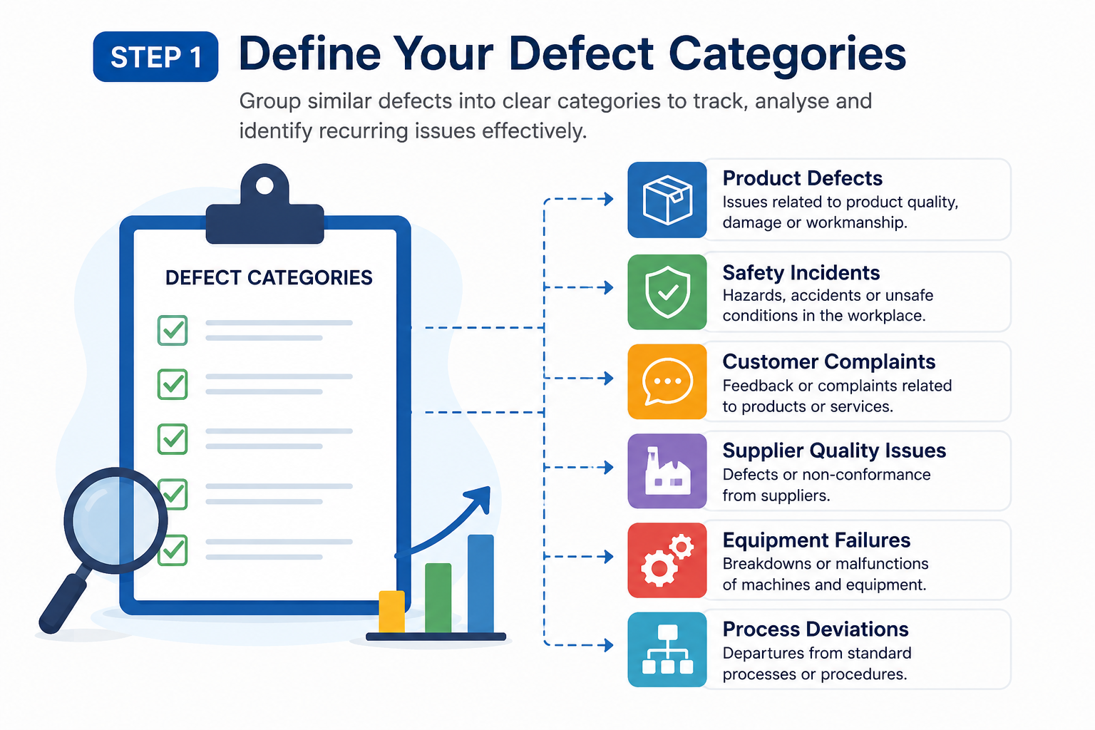
Step 1 — Define Your Defect Categories
The first step when building a Paynter Chart in Excel is creating consistent defect categories.
Without standardised categories, reporting quickly becomes messy and trend analysis becomes unreliable.
Most organisations group incidents into areas such as:
- product defects
- safety incidents
- customer complaints
- supplier quality issues
- equipment failures
- process deviations
Keeping categories simple is important. Many businesses make the mistake of creating too many detailed classifications, which makes long-term reporting harder to manage.
Well-structured categories improve:
- root cause analysis
- trend visibility
- operational consistency
- corrective action tracking
- quality management reporting
This is one reason many teams start with a paynter chart template free download before building a customised reporting structure.
Step 2 — Organise Data By Time Period
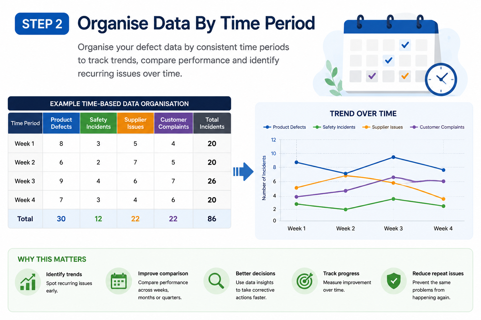
Step 2 — Organise Data By Time Period
A Paynter Chart works best when operational data is tracked consistently over time. Most businesses organise reporting by:
- weekly tracking
- monthly reporting
- quarterly reviews
Time-based tracking helps organisations identify:
- recurring operational failures
- seasonal issues
- supplier performance trends
- repeated workplace incidents
- long-term process weaknesses
Without consistent time periods, recurring patterns become difficult to recognise. Many Paynter Chart Examples fail because data is entered inconsistently across departments or reporting cycles.
Using structured timelines inside Excel makes operational trends far easier to visualise and compare over time.
Step 3 — Create A Structured Excel Table
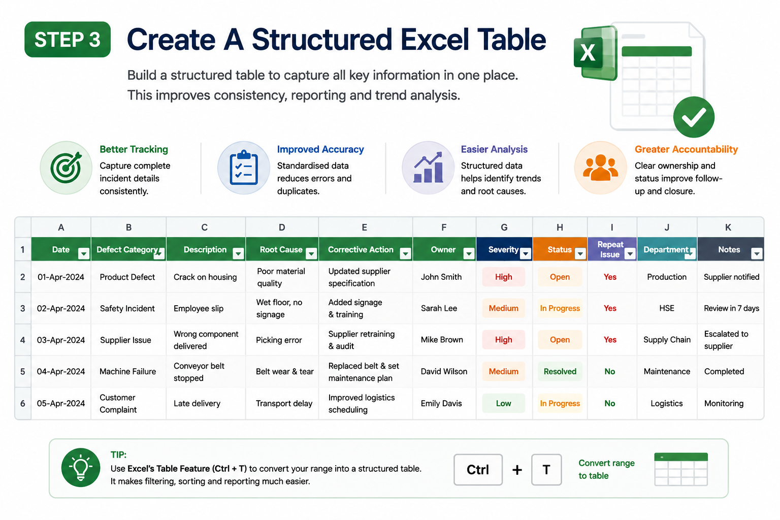
Step 3 — Create A Structured Excel Table
Once categories and timelines are defined, the next step is building a structured reporting table inside Excel. This creates the foundation for the Paynter Chart itself.
Most businesses include columns such as:
- date
- defect type
- root cause
- corrective action
- incident status
- repeat issue indicator
Additional fields may also include:
- supplier name
- department owner
- severity level
- operational impact
- compliance reference
A structured table improves:
- reporting consistency
- operational visibility
- audit preparation
- corrective action management
- historical defect tracking
Many organisations use a paynter chart pdf example as a visual reference before creating their own Excel version.
Step 4 — Build The Paynter Chart In Excel
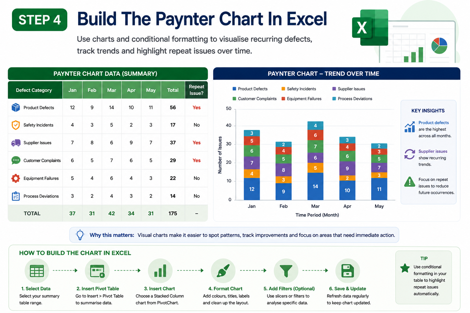
Step 4 — Build The Paynter Chart In Excel
After organising the data, the next step is transforming the information into a visual Paynter Chart in Excel. This is where recurring operational patterns become much easier to identify.
Most Excel-based Paynter Charts use:
- pivot tables
- stacked bar charts
- conditional formatting
- colour-coded trend indicators
- recurring issue highlights
Visual reporting helps quality teams quickly recognise:
- rising defect trends
- unresolved incidents
- recurring supplier issues
- failed corrective actions
- operational bottlenecks
One reason businesses prefer Excel is because the charts can be customised without needing specialist reporting software. Many paynter chart free resources also include downloadable Excel templates that simplify setup.
Step 5 — Analyse Patterns & Recurring Problems
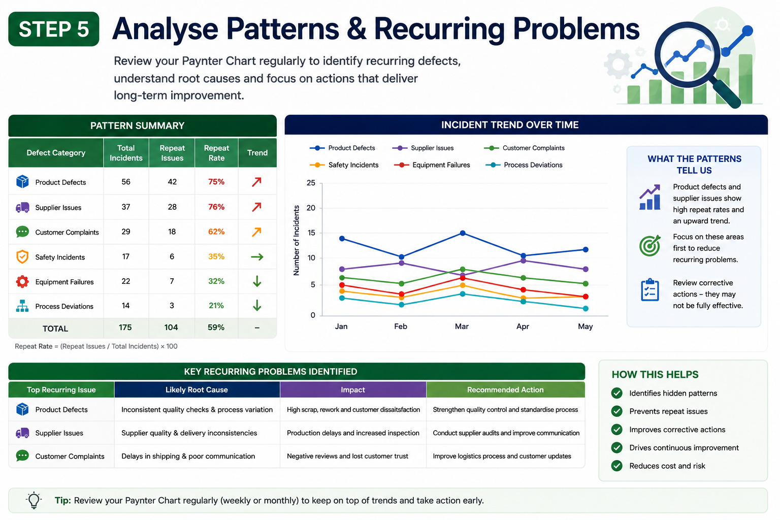
Step 5 — Analyse Patterns & Recurring Problems
The final step is analysing the data to identify recurring operational problems and process weaknesses. This is where the Paynter Chart becomes most valuable.
Instead of focusing only on individual incidents, businesses can identify:
- recurring root causes
- repeat safety failures
- ongoing supplier issues
- repeated customer complaints
- ineffective corrective actions
This helps organisations move from reactive problem-solving toward continuous improvement and long-term operational optimisation.
Many businesses discover that the same operational failures have been quietly repeating for months without management fully recognising the scale of the issue.
Common Mistakes When Creating A Paynter Chart In Excel
Many Paynter Charts fail because businesses overcomplicate the reporting process or collect inconsistent data. The chart itself is only as effective as the information being tracked.
Some of the most common mistakes include:
- creating too many defect categories
- missing historical incident data
- inconsistent reporting periods
- poor corrective action documentation
- disconnected spreadsheets
- unclear ownership tracking
Another major issue is focusing only on data collection instead of operational analysis. A Paynter Chart should help organisations identify trends and recurring risks — not simply generate more spreadsheets.
Keeping the reporting structure simple, consistent, and visual is usually the most effective approach for long-term quality management success.
Best Paynter Chart Templates To Get Started Faster

Paynter Chart Templates
Using a structured Paynter Chart template can save businesses significant time when setting up quality reporting, corrective action tracking, and operational trend analysis.
Many organisations struggle because their reporting systems become overly complex, inconsistent, or difficult to maintain over time.
A good Paynter Chart template should make recurring issues easier to identify — not create more reporting confusion.
The best templates focus on simplicity, consistent data entry, and clear visual trend tracking.
Pareto-Chart-Excel-Template
936 kb
Basic Paynter Chart Templates
Basic Paynter Chart templates are ideal for businesses that want a simple way to monitor recurring defects and operational issues without using advanced reporting software.
These templates usually include:
- defect categories
- incident dates
- root cause tracking
- corrective action status
- repeat issue indicators
Many teams start with a paynter chart template free download because it provides a fast way to organise reporting processes without building a chart from scratch.
Simple templates work well because they:
- improve consistency
- reduce manual errors
- simplify reporting
- make trend analysis easier
- improve operational visibility
One of the biggest mistakes businesses make is overcomplicating reporting structures too early. Simplicity often delivers better long-term reporting accuracy.
Manufacturing Quality Templates
Manufacturing quality templates are designed specifically for production environments where recurring defects, supplier quality issues, and equipment failures must be monitored closely.
These Paynter Chart Examples often include:
- production line tracking
- supplier defect reporting
- downtime monitoring
- product quality trends
- corrective action workflows
A manufacturing-focused paynter chart pdf is commonly used during operational reviews, supplier audits, and compliance inspections because it provides a clear visual history of recurring operational issues.
Structured manufacturing templates help businesses:
- reduce repeated defects
- improve supplier accountability
- strengthen quality assurance
- improve root cause analysis
- monitor long-term operational performance
Many organisations also customise templates based on production departments or factory locations to improve reporting accuracy.
Corrective Action Tracking Templates
Corrective action templates focus heavily on monitoring whether operational problems were properly resolved over time.
Many businesses document corrective actions but fail to track whether those actions actually prevented recurring incidents.
A corrective action Paynter Chart template usually includes:
- issue ownership
- corrective action status
- completion dates
- escalation tracking
- repeat issue monitoring
This improves:
- accountability
- process transparency
- audit readiness
- operational follow-up
- continuous improvement reporting
Without structured corrective action tracking, organisations often repeat the same operational mistakes because there is limited visibility into failed interventions.
Many businesses use paynter chart free templates to improve corrective action management before investing in larger quality management systems.
Excel Paynter Chart Templates
Excel remains one of the most popular tools for building a Paynter Chart because it is flexible, accessible, and easy to customise.
A Paynter Chart in Excel allows teams to organise operational data, create visual reports, and monitor recurring issues without needing specialist reporting software.
Most Excel Paynter Chart templates include:
- pivot tables
- stacked charts
- conditional formatting
- trend analysis tables
- recurring issue highlights
Excel templates work well because they:
- simplify reporting setup
- reduce manual formatting
- improve trend visibility
- support custom workflows
- allow easy updates over time
Many teams begin with a paynter chart template free Excel download before expanding into more advanced dashboards or automated reporting systems.
The key to success with Excel reporting is consistency. Poor data entry standards can quickly make even the best template unreliable.
Customisable Paynter Chart Dashboard Templates
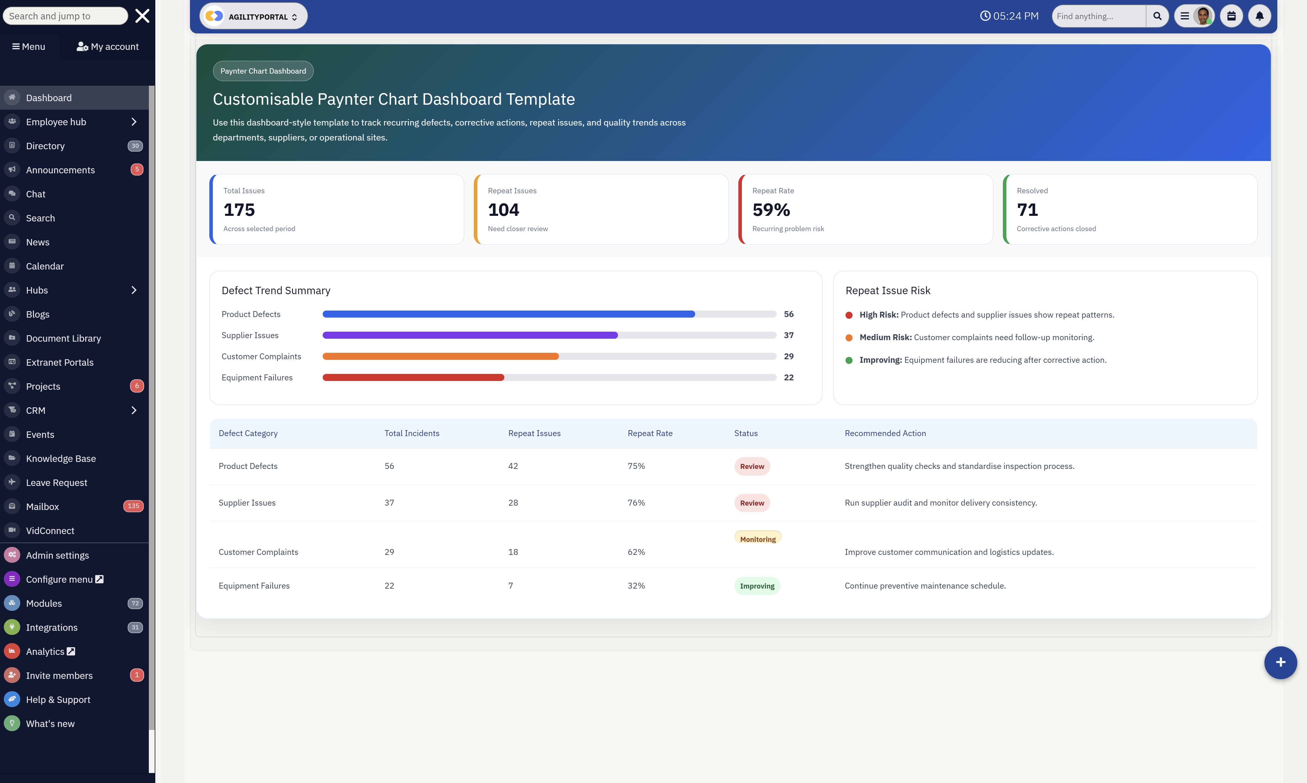
Customisable Paynter Chart Dashboard Templates
Dashboard-style Paynter Chart templates are designed for organisations that need higher-level operational visibility across departments, suppliers, or multiple reporting locations.
These templates often combine:
- charts
- trend dashboards
- KPI tracking
- corrective action summaries
- operational performance metrics
A customisable dashboard helps leadership teams identify:
- recurring operational risks
- rising defect trends
- unresolved incidents
- supplier performance issues
- long-term quality improvements
Many modern dashboard templates also include filters and visual indicators that make recurring patterns easier to identify compared to static spreadsheets.
The most effective dashboard templates balance visual reporting with simplicity. Overly complex dashboards often create more confusion instead of improving operational insight.
This is why many businesses start with smaller Paynter Chart Examples first before expanding into enterprise-level reporting dashboards.
Paynter Chart vs Pareto Chart — What's The Difference?
| Comparison Area | Paynter Chart | Pareto Chart |
| Main Purpose | Tracks recurring defects, operational trends, and corrective action effectiveness over time. | Identifies the biggest problems based on frequency or impact using the 80/20 principle. |
| Primary Focus | Long-term trend analysis and repeat issue monitoring. | Prioritising the most common or costly issues first. |
| Best For | Root cause analysis, recurring defect tracking, quality management, and operational visibility. | Identifying high-frequency defects and prioritising immediate improvement efforts. |
| Data Structure | Tracks issues across weeks, months, or quarters. | Displays issues ranked by frequency or severity. |
| Trend Visibility | Excellent for identifying recurring operational patterns and repeated failures. | Limited long-term trend visibility. |
| Corrective Action Tracking | Strong focus on monitoring whether corrective actions solved recurring issues. | Minimal corrective action tracking. |
| Visual Style | Uses Excel tables, stacked charts, trend analysis, and recurring issue indicators. | Uses descending bar charts with cumulative percentage lines. |
| Common Industries | Manufacturing, healthcare, workplace safety, logistics, and quality assurance. | Manufacturing, Six Sigma, process improvement, and operational optimisation. |
| When To Use It | Best when businesses need to monitor recurring problems over time and improve accountability. | Best when teams need to identify the biggest contributors to operational problems quickly. |
| Long-Term Quality Tracking | Better suited for continuous improvement and long-term quality management. | Better suited for short-term prioritisation and quick defect analysis. |
The Future Of Paynter Charts In Modern Quality Management
The future of the Paynter Chart is moving far beyond basic spreadsheets and manual reporting.
As businesses generate larger amounts of operational data, organisations are starting to combine traditional Paynter Chart methodologies with AI-powered analytics, real-time dashboards, and connected quality management systems.
The goal is no longer just tracking defects after they happen — it is identifying operational risks before they become larger business problems.
Modern businesses now rely heavily on AI and automated quality tracking to monitor recurring defects, supplier issues, customer complaints, and workplace incidents in real time.
Instead of manually reviewing spreadsheets every month, AI systems can automatically identify recurring patterns, highlight abnormal trends, and alert teams when operational risks begin increasing.
This allows organisations to respond faster and reduce the likelihood of repeated failures.
Real-time operational dashboards are also changing how Paynter Chart data is visualised across businesses.
Many organisations now use connected dashboards that pull information directly from production systems, service platforms, workplace safety tools, and operational databases.
This gives leadership teams instant visibility into recurring defect trends, corrective action progress, and quality performance across multiple departments or locations.
Another major shift is the rise of connected quality management systems.
Traditional quality reporting often exists inside disconnected spreadsheets and isolated departments, making it difficult to identify long-term operational patterns.
Modern systems integrate quality tracking with compliance management, supplier monitoring, incident reporting, maintenance systems, and workflow automation. This creates a far more connected approach to operational visibility and continuous improvement.
Predictive defect analysis is also becoming increasingly important in quality management environments.
Instead of waiting for recurring issues to happen repeatedly, businesses can now use historical operational data to predict where future defects are most likely to occur. This helps organisations move from reactive problem-solving toward proactive operational prevention.
The psychological shift behind modern Paynter Chart systems is significant. Businesses are no longer satisfied with simply documenting operational failures after they occur.
They want faster visibility, predictive insights, automated reporting, and connected quality intelligence that helps reduce risk before problems escalate into larger operational or financial damage.
Final Thoughts On Using A Paynter Chart
A Paynter Chart remains one of the most effective tools for identifying recurring defects, improving root cause analysis, and strengthening long-term quality management processes.
Instead of relying on isolated incident reports or disconnected spreadsheets, businesses can use structured visual tracking to uncover patterns that would otherwise remain hidden across departments, suppliers, and operational systems.
The biggest advantage of a Paynter Chart is its ability to help organisations stop repeating the same operational mistakes.
By tracking recurring issues over time, quality teams can monitor whether corrective actions are actually working or if the same problems continue returning. This improves accountability, operational visibility, and continuous improvement efforts across the organisation.
Many businesses still rely heavily on manual spreadsheets and reactive reporting processes, which often create fragmented data, inconsistent tracking, and poor historical visibility.
Over time, this makes it much harder to identify operational trends or prevent recurring quality failures before they escalate.
Modern workplace and operational platforms are now helping organisations centralise quality management, corrective action workflows, incident reporting, and trend analysis into one connected system.
This creates faster visibility, stronger collaboration, and more proactive operational decision-making.
As businesses continue focusing on efficiency and risk reduction, the Paynter Chart will remain an important tool for improving quality performance and long-term operational control.
AI Summary
- A Paynter Chart helps organisations track recurring defects, operational failures, corrective actions, and quality trends over time using structured visual reporting.
- The Ford Paynter Chart methodology became widely used in manufacturing because it improved visibility into repeat defects, supplier quality issues, and long-term operational risks.
- Many businesses still use a Paynter Chart in Excel to simplify defect tracking, root cause analysis, incident reporting, and corrective action management.
- Paynter Chart Examples are commonly used across manufacturing, healthcare, workplace safety, logistics, and IT operations to identify recurring operational problems.
- Using a paynter chart template free download helps organisations standardise quality reporting and improve consistency across departments and operational sites.
- Modern quality management systems are combining Paynter Chart reporting with AI analytics, dashboards, predictive defect analysis, and connected operational data for faster decision-making.
FAQ
What Is A Paynter Chart Used For?
A Paynter Chart is used to track recurring defects, operational failures, corrective actions, and quality trends over time.
Businesses use a Paynter Chart to identify repeat issues that continue appearing across departments, suppliers, production lines, or operational processes. Unlike basic spreadsheets, a Paynter Chart helps organisations visualise long-term patterns and improve root cause analysis.
Many businesses rely on Paynter Chart Examples to improve quality management, incident reporting, workplace safety monitoring, and continuous improvement initiatives.
What Is A Ford Paynter Chart?
A Ford Paynter Chart refers to the quality tracking methodology popularised by Ford to monitor recurring defects and corrective action performance across manufacturing operations.
The Ford Paynter Chart approach helped improve visibility into supplier issues, repeated failures, and long-term operational risks.
Today, many manufacturing and quality management teams still use Ford Paynter Chart reporting methods to improve operational accountability and reduce recurring quality problems.
How Do You Create A Paynter Chart In Excel?
To create a Paynter Chart in Excel, businesses typically organise data into structured categories such as defect type, root cause, corrective action, incident date, and repeat issue tracking.
A Paynter Chart in Excel often includes pivot tables, stacked charts, colour-coded trend indicators, and recurring issue monitoring. Many organisations start with a paynter chart template or a paynter chart template free download to simplify setup.
Understanding how to create a Paynter Chart in Excel is important for businesses that want better operational visibility without investing in expensive reporting software.
Are There Free Paynter Chart Templates?
Yes, many businesses use paynter chart template free resources to simplify quality tracking and operational reporting. Free templates are commonly available in Excel, PDF, and Word formats depending on reporting requirements.
A paynter chart template word file is often useful for smaller businesses that need basic documentation, while a paynter chart pdf is commonly used for audit reviews and operational reporting.
Many organisations also use paynter chart free Excel templates to standardise defect tracking across departments.
What Is The Difference Between A Paynter Chart And A Pareto Chart?
A Paynter Chart focuses on tracking recurring operational problems and corrective action trends over time, while a Pareto Chart identifies the biggest problems based on frequency or impact.
A Paynter Chart is better suited for long-term quality management, root cause analysis, and recurring defect monitoring.
In contrast, a Pareto Chart helps businesses prioritise which issues need immediate attention first. Many quality teams use both charts together to improve operational analysis and continuous improvement reporting.
Can Small Businesses Use Paynter Charts?
Yes, small businesses can benefit significantly from using a Paynter Chart, especially when managing recurring customer complaints, workplace incidents, supplier issues, or operational inefficiencies.
Many smaller organisations start with a simple paynter chart in Excel because it provides structured reporting without requiring expensive quality management systems.
Using a paynter chart template can also help small teams improve consistency and operational visibility as the business grows.
What Industries Use Paynter Charts Most?
Paynter Charts are widely used across manufacturing, automotive, healthcare, logistics, workplace safety, construction, and IT operations.
Manufacturing companies often use Ford Paynter Chart reporting methods to monitor supplier quality, recurring defects, and corrective actions.
Healthcare organisations use Paynter Chart Examples for patient safety tracking and compliance reporting, while operational teams use them to improve incident visibility, trend analysis, and long-term quality management.
Most Popular Posts

Effective communication among team members is vital for the productivity and success of any organization. Surprisingly, 60% of companies lack a long-term internal communication strategy, which p...


Businesses thrive on communication for efficiency, productivity and accomplishment. When the right information is passed from the right designation in the organization, it promotes positivity an...
Categories
Blog
(3012)
Business Management
(380)
Employee Engagement
(225)
Digital Transformation
(194)
Growth
(143)
Intranets
(137)
Remote Work
(63)
Sales
(53)
Collaboration
(48)
Customer Experience
(30)
Culture
(30)
Project management
(29)
Knowledge Management
(28)
Leadership
(20)
Comparisons
(9)
News
(1)

Related Posts

Generative AI has rapidly moved from trend to transformative force, reshaping industries across the board. But perhaps its most visible impact has been in the marketing world—streamlining everything from ad creation to email copywriting in seco...

Many businesses still rely on software that was built 10, 15, or even 20 years ago. At first glance, these systems may seem cost-effective because they are already paid for and deeply embedded into daily operations. However, beneath the s...
")
Artificial intelligence is everywhere right now. From employee communication platforms and HR software to project management tools and company knowledge bases, businesses are racing to add AI to their workplace technology stack. The promise is ...

Launching a startup is exciting, but it can also be expensive if you build the wrong product. That's why many founders choose to start with a Minimum Viable Product (MVP) before committing significant time and money to full-scale development. A...

Walk into almost any workplace today and you'll find employees juggling a growing number of tools. One platform for chat, another for project management, a separate HR system, multiple document repositories, and countless email chains just to g...


Jill Romford
I am a digital nomad, lover of exploring new places and making friends.
I love to travel and I love the internet. I take pictures of my travels and share them on the internet using Instagram.
Traveler, entrepreneur, and community builder. I share my insights on digital marketing and social media while inspiring you to live your fullest life.
Ready to learn more? 👍
One platform to optimize, manage and track all of your teams. Your new digital workplace is a click away. 🚀
Free for 14 days, no credit card required.