Insight Blog
Agility’s perspectives on transforming the employee's experience throughout remote transformation using connected enterprise tools.
27 minutes reading time
(5398 words)
How to Improve Any Dashboard with Simple UI Tips & Tricks

How to Improve Any Dashboard with Simple UI Tips & Tricks
Learn how to improve any dashboard with simple UI tips & tricks that boost usability, engagement, and performance without a full redesign.
How to Improve Any Dashboard with Simple UI Tips & Tricks

Most dashboards don't fail because of bad data — they fail because of poor design, weak usability, and a lack of clear user experience.
If you're trying to improve dashboard UI, you're likely facing common issues like low adoption, poor user engagement, confusing layouts, or stakeholders ignoring key metrics altogether.
These are classic signs of a dashboard that looks good on the surface but fails in real-world use.
In fact, research from McKinsey shows that employees spend up to 28% of their workweek searching for information across disconnected systems — a clear indicator of poor dashboard usability and fragmented data visualization design.
The good news?
You don't need a full rebuild or a new BI tool.
With the right dashboard UI tips & tricks, dashboard design best practices, and a focus on user-centric design, you can quickly improve clarity, streamline navigation, and turn your dashboard into something people actually use to make decisions.
28%
of the workweek
According to McKinsey, employees can spend up to 28% of their workweek searching for information across disconnected systems.
Source: McKinsey Global Institute
Key Takeaways
- Improving dashboard UI focuses on usability, clarity, and user experience, ensuring users can quickly understand data and take action without confusion.
- Most dashboards fail due to poor design choices such as overloaded visuals, lack of hierarchy, and missing context, leading to low adoption and disengagement.
- Applying dashboard design best practices like reducing cognitive load, using consistent patterns, and designing for scanning improves usability and performance.
- Role-based dashboards and personalised views increase engagement by showing users only the data that is relevant to their role and responsibilities.
- High-performing dashboards connect data with action, helping teams make faster decisions, improve productivity, and drive real business outcomes.
Why Most Dashboards Fail (And What That Costs You)
Most dashboards aren't failing because the data is wrong — they're failing because the dashboard UI, layout, and overall user experience make it hard for people to actually use the data.
This is where a lot of businesses get it wrong.
They invest in tools, integrations, and data pipelines… but completely overlook dashboard design best practices and usability principles.
Let's break down the real problems.
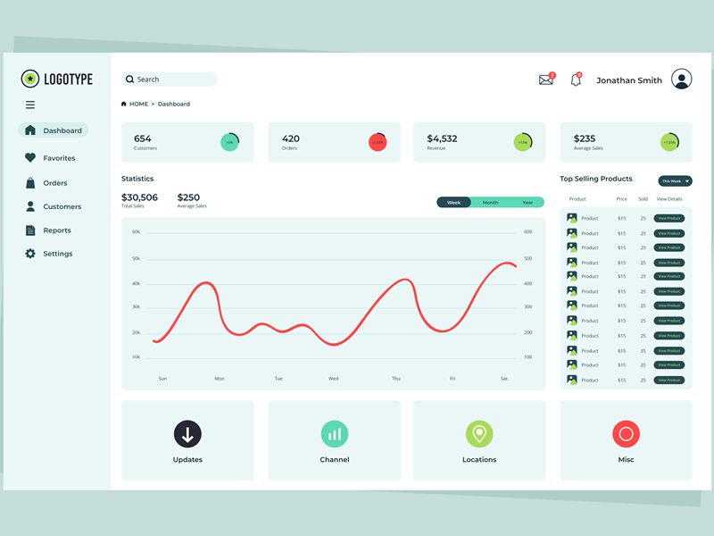
Too Much Data, No Information Hierarchy
One of the biggest issues in dashboard UI design is trying to show everything at once.
You end up with:
- 10+ widgets competing for attention
- No clear primary KPI
- Users not knowing where to look first
Without a strong visual hierarchy, your dashboard becomes noise instead of insight.
👉 A high-performing dashboard should guide the user's eye:
- Top = most critical metrics
- Middle = supporting data
- Bottom = detailed breakdowns
Poor Navigation and Layout
If users have to think too hard about where to click, the dashboard is already broken.
Common problems include:
- Hidden menus
- Too many tabs or sections
- No logical grouping of data
This creates friction and slows down decision-making — the exact opposite of what a business dashboard is supposed to do
No Clear User Journey
Most dashboards are built for "everyone" — which means they work for no one.
An Operations Manager, HR leader, and executive all need different insights. Without a defined user journey, dashboards become generic and irrelevant.
That's why role-based dashboards and personalised views are now considered standard in modern dashboard UX design.
Data Without Context
Raw numbers don't drive action — context does.
A common mistake in data dashboard design is showing:
- Metrics without benchmarks
- Numbers without trends
- KPIs without explanations
Users are left asking:
👉 "Is this good or bad?"
👉 "What should I do next?"
Without context, even the best data becomes useless.
The Real Cost: Productivity, Adoption, and Decision-Making
This isn't just a design issue — it's a business problem.
Research from McKinsey shows that employees spend up to 28% of their workweek searching for information, often because systems and dashboards are poorly structured and disconnected.
That leads to:
- Lost productivity → teams waste time navigating instead of acting
- Poor decision-making → unclear or delayed insights
- Low dashboard adoption → people stop using the tool entirely
And once adoption drops, your dashboard becomes just another unused system.
A poorly designed dashboard doesn't just look bad — it actively slows your business down.
The best dashboards follow the same core principles you'll see in Clay's global branding insights: clarity, consistency, and user-first design.
If your dashboard isn't helping users make faster, better decisions, it's not doing its job — no matter how powerful the data behind it is.
1,000+
cloud apps per enterprise
According to Gartner, the average enterprise now uses over 1,000 cloud applications, with nearly 70% introduced without IT approval.
Source: Gartner
What Makes a High-Performing Dashboard UI?
A high-performing dashboard UI isn't about adding more charts, widgets, or visual elements — it's about making the right information instantly accessible and easy to act on.
f you're looking to improve dashboard UI, the focus should always be on usability, clarity, and delivering value in seconds, not minutes.
At its core, great dashboard design prioritises clarity over complexity. Users shouldn't have to interpret what they're looking at or spend time figuring out where to go next.
The layout, labels, and data visualisation should be intuitive enough that even a first-time user can understand the key insights without training. This is a fundamental principle in dashboard UX design and one of the biggest gaps in poorly performing dashboards.
Another key factor is actionable data. Many dashboards fall into the trap of presenting data for the sake of it — charts that look impressive but don't actually drive decisions. A well-designed business dashboard connects every metric to an outcome.
Users should immediately understand what the data means, whether performance is improving or declining, and what action needs to be taken next.
Relevance also plays a huge role.
A high-performing dashboard is not one-size-fits-all — it's role-based and personalised.
An HR manager, operations lead, and executive team all require different insights, and forcing them into the same generic dashboard reduces engagement and effectiveness.
Modern dashboard UI best practices focus heavily on tailoring the experience so users only see what matters to them.
Performance cannot be ignored either.
Even the best-designed dashboard will fail if it's slow or unresponsive.
Fast load times, smooth navigation, and mobile responsiveness are now expected standards, especially for teams working across devices or in frontline environments. Poor performance directly impacts dashboard adoption and overall user satisfaction.
Ultimately, a high-performing dashboard follows one simple rule: it should answer a question almost instantly.
In fact, a good benchmark in dashboard usability is that a user should be able to find what they need and understand it in under five seconds. If it takes longer than that, the design needs work.
10 Simple UI Tips & Tricks to Improve Your Intranet Dashboard
1. Prioritize Information Hierarchy
Most dashboards fail at the very first step — they treat everything as equally important. In reality, users land on a dashboard with a question in mind, and your layout should answer that immediately.
The most critical KPIs should sit right at the top, clearly visible without scrolling, while secondary insights support the story underneath.
An operations manager opens a dashboard to check performance.
If revenue, delays, and KPIs are buried under charts, they waste time. If those metrics are front and center, decisions happen instantly.
2. Reduce Cognitive Load
If a user has to stop and think about what they're looking at, you've already lost them.
Overloaded dashboards with too many widgets, filters, and charts create friction and slow people down. The goal is not to show more data, but to make data easier to understand.
A dashboard with 15 widgets looks impressive, but users only interact with 4 of them.
Removing the rest makes the experience faster, clearer, and actually usable.
3. Use Consistent Design Patterns
Inconsistent dashboards create confusion fast.
When buttons behave differently, colors mean different things, or layouts change across pages, users have to constantly relearn the interface. That kills efficiency and increases frustration.
Common issues you'll see include:
- Buttons performing different actions across similar screens
- Colors representing different meanings in different sections
- Layouts shifting between pages with no clear structure
- Filters and controls behaving inconsistently
If "green" means success on one page but something different on another, users hesitate. Consistency removes that hesitation and builds confidence in the system.
4. Design for Scanning, Not Reading
Nobody is reading your dashboard line by line.
People scan quickly, looking for signals, trends, or anything that stands out.
Your design should support fast consumption with clear headings, spacing, and strong visual hierarchy that naturally guides the eye.
To improve scanability, focus on:
- Clear section headings that break content into logical groups
- Visual contrast to highlight key metrics and changes
- Whitespace to reduce clutter and improve readability
- Icons or indicators that help users interpret data faster
A manager checks the dashboard between meetings. If they can spot issues in five seconds, it works. If they need two minutes to understand it, they stop using it.
5. Add Context to Your Data
Raw numbers don't drive decisions — context does. A metric without comparison or trend leaves users guessing.
Adding benchmarks, time comparisons, or indicators makes the data meaningful instantly.
"Sales: £50,000" means nothing on its own. "Sales: £50,000, up 12% this week" immediately tells a story and drives action.
6. Make It Role-Based
One of the biggest mistakes companies make is building a single dashboard for everyone.
Different roles care about different outcomes, and forcing everyone into the same view reduces relevance, clarity, and overall engagement.
A well-designed dashboard should adapt to the user, not the other way around, ensuring each person sees only what matters most to their responsibilities.
To make dashboards more effective, focus on:
- Creating role-specific views for HR, operations, leadership, and frontline teams
- Displaying only relevant KPIs instead of overwhelming users with unnecessary data
- Personalising dashboards based on department, location, or job function
- Allowing users to customise or pin the metrics they use most frequently
When dashboards are tailored correctly, they become significantly easier to use and far more valuable in day-to-day decision-making.
Users spend less time filtering through irrelevant data and more time acting on insights that directly impact their role.
An HR team cares about engagement and retention, while operations focus on output and efficiency. Showing both in one dashboard creates clutter and reduces usefulness for both groups.
A role-based dashboard ensures each team gets a focused, relevant experience that actually supports their goals.
7. Improve Navigation and Flow
Even a well-designed dashboard can fail if users can't move through it easily. Poor navigation, too many clicks, or unclear sections create frustration and slow everything down.
Strong dashboard navigation, user flow, and dashboard usability are critical for improving overall user experience and increasing adoption.
To improve navigation and flow, focus on:
- Reducing the number of clicks required to access key reports and insights
- Grouping related data into clear sections or tabs for better structure
- Using intuitive menus and labels that match user expectations
- Keeping navigation consistent across all dashboard pages
- Highlighting frequently used areas for quicker access
A smooth dashboard user experience (UX) ensures users can move naturally from one task to another without friction. When navigation feels effortless, users are more likely to return regularly and rely on the dashboard for decision-making.
If it takes five clicks to find a report, users won't bother. If it's one click from the main dashboard, it becomes part of their daily workflow.
8. Use Color with Purpose
Color should guide decisions, not decorate the screen.
Every color used should have a clear meaning, helping users quickly identify issues, successes, or priorities.
A spike in red immediately signals a problem. If everything is colorful with no meaning, nothing stands out and users miss critical insights.
9. Optimize for Mobile and Frontline Teams
Dashboards are no longer just desktop tools.
Many users rely on mobile access for quick updates and real-time insights, especially in frontline or distributed teams.
A field worker checks updates on their phone.
If the dashboard is cluttered or unreadable on mobile, they ignore it. If it's clean and simple, it becomes part of their routine.
10. Make It Actionable
The biggest difference between a good dashboard and a great one is actionability. A dashboard should not just show what's happening — it should guide users on what to do next.
Strong dashboard UX, actionable insights, and data-driven decision-making are what turn dashboards into real business tools.
To make your dashboard actionable, focus on:
- Adding clear next steps or recommended actions alongside key metrics
- Including buttons or triggers for tasks, workflows, or communications
- Highlighting issues that require immediate attention or follow-up
- Connecting data directly to actions, such as assigning tasks or sending alerts
- Using real-time notifications to prompt faster responses
When dashboards are built around action, users don't just observe performance — they respond to it. This shift is what improves engagement, speeds up decisions, and increases the overall value of your dashboard
Seeing a drop in engagement is useful. Having a button to trigger a survey or send a message makes it actionable and immediately valuable.
Common Dashboard UI Mistakes to Avoid (Why Your Dashboard Isn't Being Used)
If your dashboard isn't being used consistently, it's not a user problem — it's a design problem.
Most dashboards fail in the same predictable ways, and once you see these patterns, it becomes obvious why adoption drops and engagement disappears.
Let's break down the most common mistakes that quietly kill dashboard usability.
Overloading the Dashboard with Too Many Charts
More data does not equal more value. One of the biggest issues in dashboard design is trying to show everything in a single view. When users are hit with too many charts, widgets, and KPIs at once, they don't engage — they disengage.
Instead of clarity, you create noise.
Instead of insight, you create confusion.
Users should never feel overwhelmed when opening a dashboard.
No Filtering or Customisation Options
A static dashboard forces every user into the same experience, regardless of their role or needs. That rarely works in real-world environments where different teams require different views.
Common issues include:
- No ability to filter by date, team, or department
- Lack of personalised views or saved preferences
- Users forced to scroll through irrelevant data
- No quick way to adjust what is being displayed
Without flexibility, your dashboard becomes rigid and frustrating to use.
Slow Performance and Load Times
Speed matters more than most teams realise. Even a well-designed dashboard will fail if it takes too long to load or respond. Users expect instant access to information, especially in fast-paced environments.
When performance drops, so does trust in the system.
Typical causes of poor dashboard performance include:
- Too many data sources loading at once
- Heavy visualisations slowing down rendering
- Poor backend optimisation or caching
- Lack of mobile performance optimisation
If users have to wait, they will simply stop using it.
Poor Contrast and Readability
If users struggle to read your dashboard, they won't use it — it's that simple. Poor color choices, low contrast, and cluttered layouts make it difficult to interpret data quickly.
This is a major issue in dashboard UI design where aesthetics are prioritised over usability.
Look out for:
- Light text on light backgrounds
- Overuse of colors without meaning
- Small fonts that are hard to read
- Crowded layouts with no spacing
A clean, readable dashboard always outperforms a visually "fancy" one.
No Onboarding or Guidance for Users
Even the best dashboards need context. If users don't understand what they're looking at or how to use the dashboard, they won't engage with it properly.
This often shows up as:
- No tooltips or explanations for metrics
- No onboarding for new users
- Lack of guidance on what actions to take
- Confusion around features or navigation
A dashboard should not require training, but it should guide users when needed.
The Reality: Why Users Stop Using Your Dashboard
When you combine all of these issues — overload, poor usability, slow performance, and lack of clarity — the result is predictable. Users stop trusting the dashboard, stop relying on it, and eventually stop using it altogether.
And once that happens, your dashboard becomes just another unused tool in your stack.
Fixing these mistakes is not about redesigning everything from scratch. It's about removing friction, improving usability, and focusing on what users actually need.
Because at the end of the day, a dashboard only works if people use it.
How to Measure If Your Dashboard UI Is Actually Working
Improving your dashboard UI is one thing — knowing whether it's actually working is something else entirely.
A lot of teams assume their dashboard is "fine" because it looks clean or loads fast, but the real test is simple: are people using it, and are they making decisions faster because of it?
If you're serious about improving dashboard usability and user experience, you need to track the right metrics.
Start with User Adoption Rate
This is the most important signal, and it tells you straight away if your dashboard is delivering value.
If users are not logging in regularly, something is wrong — either with relevance, usability, or performance.
Look for:
- Daily or weekly active users
- Login frequency per role or department
- Drop-off rates after initial use
Low adoption usually means the dashboard is either too complex or not useful enough.
Track Time Spent on the Dashboard
Time on dashboard can be tricky to interpret, but it gives strong insight into usability.
If users are spending too long trying to find information, your layout or navigation likely needs work.
If they're leaving too quickly, the dashboard may not be engaging or relevant.
The goal is balance:
- Enough time to review insights
- Not so long that it feels like effort
Measure Click-Through Rates (CTR)
Clicks tell a story.
If users are interacting with filters, reports, or actions, it means the dashboard is doing its job. If they're not clicking anything, they're probably not finding value.
Focus on:
- Clicks on key reports or widgets
- Interaction with filters and controls
- Engagement with actionable elements
This is where strong dashboard UX design really shows.
Monitor Feature Usage
Most dashboards have features that never get used.
That's a clear sign of poor design or unnecessary complexity. By tracking which features are actually being used, you can identify what matters and what should be removed or improved.
Key things to analyse:
- Most used vs least used widgets
- Feature engagement by role
- Tools or sections that users ignore
This helps you simplify and optimise the overall experience.
Track Task Completion Rate
At the end of the day, dashboards exist to support actions.
Whether it's reviewing performance, approving a task, or responding to an issue, users should be able to complete their goal quickly.
A strong dashboard will:
- Reduce time to complete tasks
- Improve accuracy of decisions
- Support clear next steps
If users cannot complete tasks efficiently, your dashboard is slowing them down.
Go Beyond Metrics: Use Analytics and Feedback
Numbers tell you what is happening, but not always why. That's where deeper insights come in.
To fully understand performance, combine:
- Engagement analytics to track behaviour patterns
- Heatmaps to see where users click, scroll, or drop off
- User feedback to understand pain points directly
This combination gives you a complete picture of how your dashboard UI is performing in real-world use.
A dashboard isn't successful because it looks good — it's successful because it gets used and drives action.
By tracking the right metrics and continuously refining the experience, you turn your dashboard into a tool people rely on, not ignore.
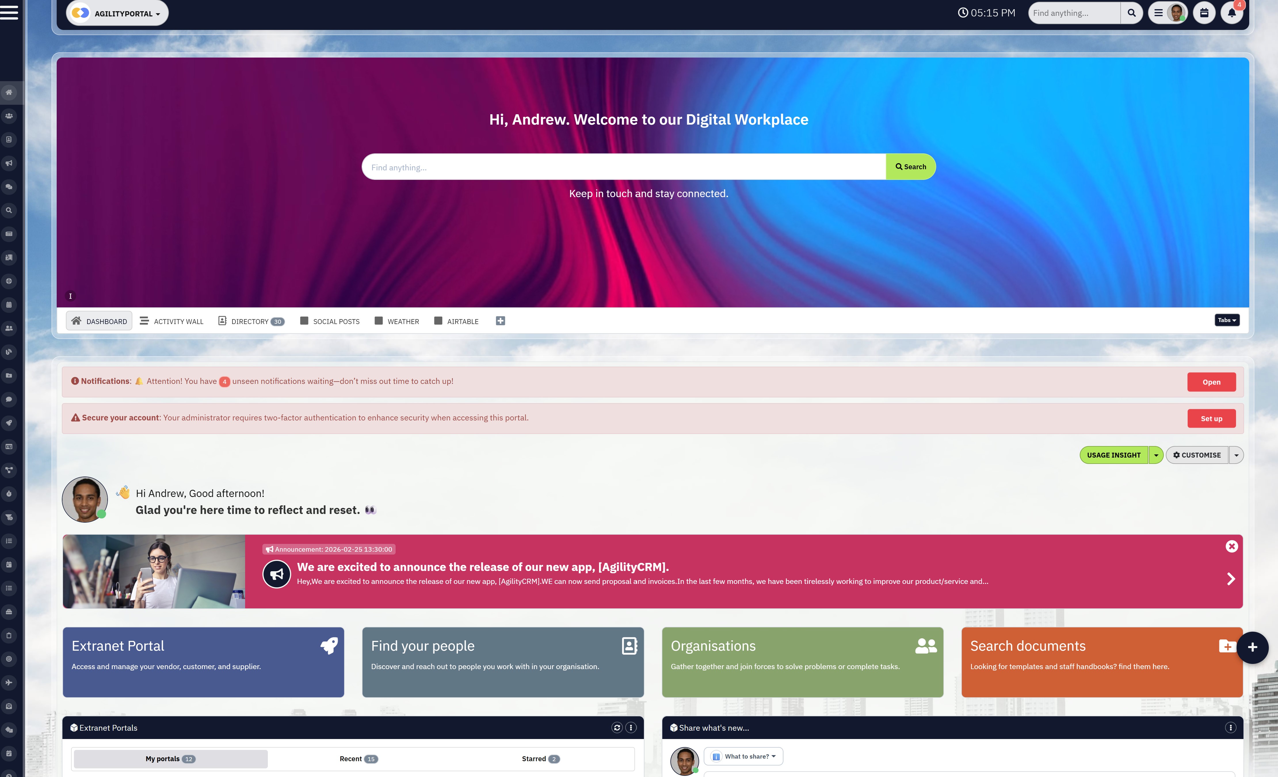
Real-World Example: How Better Dashboard UI Transforms Daily Operations
Let's make this practical, because this is where everything clicks.
Imagine an Operations Manager responsible for tracking performance across multiple teams.
They rely on a dashboard daily to monitor KPIs, identify issues, and make quick decisions.
On paper, everything is there — data, charts, reports — but in reality, the experience is slow, frustrating, and inefficient.
Before: A Dashboard That Looks Busy but Delivers Nothing
The dashboard is packed with information, but none of it is structured in a way that actually helps.
There are over ten widgets on the screen, all competing for attention, with no clear priority or flow.
Important metrics are buried under less relevant data, forcing the user to search every time they log in.
Common problems include:
- Too many widgets displayed at once with no clear hierarchy
- No clear primary KPIs visible on arrival
- Data scattered across multiple sections and tabs
- Manual effort required to pull reports or interpret trends
Instead of helping, the dashboard slows everything down. The Operations Manager ends up exporting data, creating manual reports, or double-checking information elsewhere. Over time, trust in the dashboard drops, and usage becomes inconsistent.
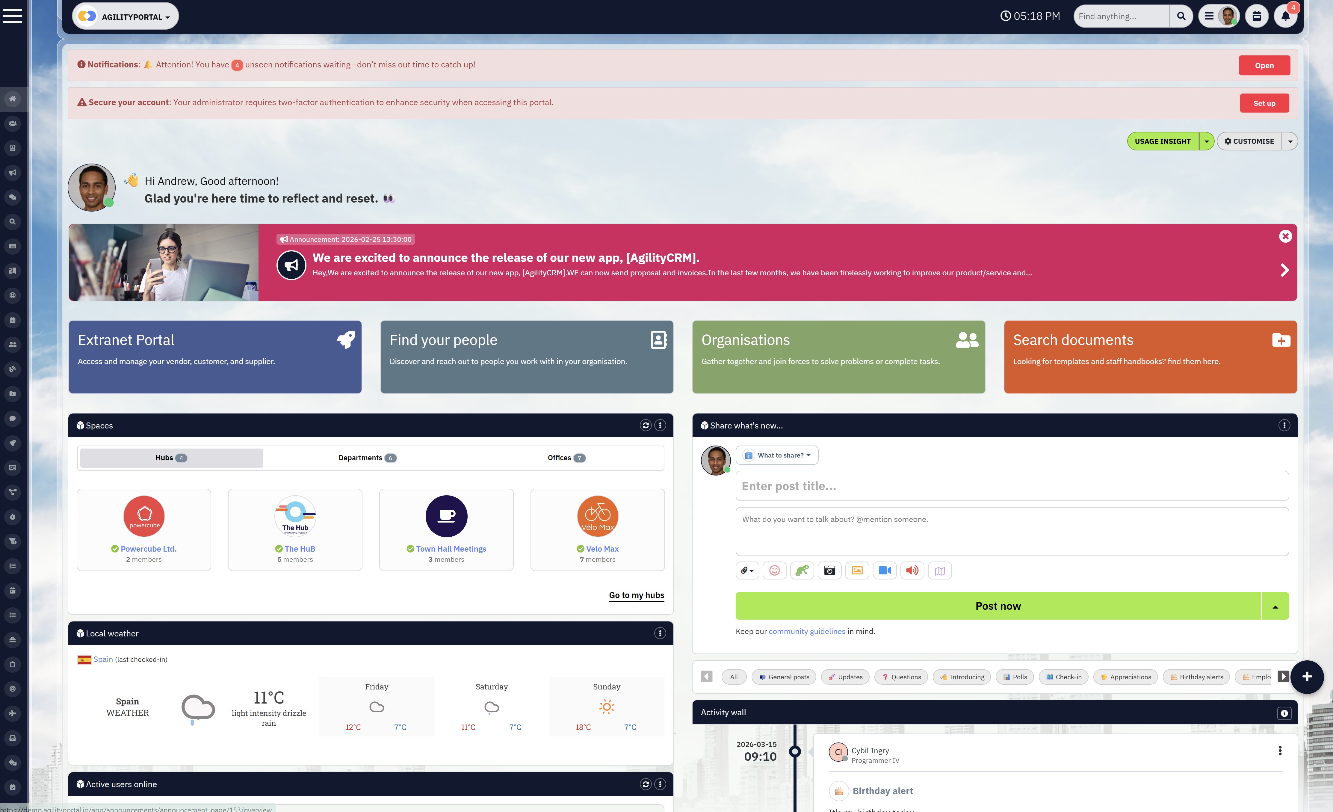
After: A Dashboard That Drives Action and Clarity
Now take the same dashboard, but redesigned using simple dashboard UI tips & tricks and best practices.
The layout is clean, focused, and built around the user's priorities.
Key metrics are positioned at the top, supported by clear visualisations and actionable insights. Navigation is simplified, and the experience feels intuitive from the moment the dashboard loads.
What changed:
- Clear, role-based KPIs visible immediately on login
- Reduced number of widgets, focusing only on high-impact data
- Logical layout with strong information hierarchy
- Built-in actions such as alerts, updates, or task triggers
The difference is immediate. The Operations Manager can now log in, understand performance in seconds, and take action without needing to dig through layers of data.
The Impact on the Business
This is where the real value shows up.
With improved dashboard usability and user experience, the team starts relying on the dashboard again. Decisions are made faster, reporting becomes more consistent, and overall productivity improves.
You typically see:
- Faster decision-making across teams
- Increased dashboard adoption and daily usage
- Reduced time spent on manual reporting
- Better alignment between teams and leadership
Why This Matters for Internal Comms and Workforce Platforms
In platforms like intranets or digital workplace tools, dashboards are not just for data — they are central to communication, engagement, and performance tracking.
If the dashboard fails, the entire experience feels fragmented.
A well-designed dashboard becomes the central hub where teams:
- Track performance
- Stay aligned on priorities
- Act on insights in real time
The difference between a bad dashboard and a great one is not the data — it's the design. When you fix the UI, simplify the experience, and focus on user needs, dashboards stop being ignored and start driving real business outcomes.
Tools That Help Improve Dashboard UI Faster
1. Platforms That Combine Dashboards with Real Workflows
If you're trying to improve dashboard UI in isolation, you'll hit limits quickly. The real shift happens when dashboards are part of a broader system — where communication, tasks, and data all connect in one place.
This is where modern digital workplace platforms and integrated tools stand out.
Instead of just showing data, these platforms allow teams to act on it immediately, which significantly improves dashboard usability, adoption, and overall business impact.
Key platform types include:
- Digital workplace platforms that combine dashboards, communication, and collaboration
- Internal communication tools with built-in analytics and engagement tracking
- Employee experience platforms with role-based dashboards and insights
- All-in-one SaaS platforms that unify data, workflows, and team interaction
Platforms that combine communication + dashboards + engagement consistently outperform standalone dashboard tools because they turn insights into action, not just visibility.
2. Supporting Tools for Data, Design, and Optimisation
Alongside core platforms, there are specialised tools that help refine and improve different aspects of your dashboard experience.
These tools focus on data visualisation, design quality, and user behaviour, all of which contribute to better dashboard UX and performance.
Common tools used include:
- BI tools (Business Intelligence): Power BI, Tableau for advanced data visualisation
- UX design tools: Figma, Adobe XD for designing and prototyping dashboard layouts
- User behaviour tools: Hotjar, Microsoft Clarity for heatmaps and interaction tracking
- Analytics tools: Google Analytics or in-platform analytics to measure dashboard usage
- Performance tools: Lighthouse or similar tools to optimise load speed and responsiveness
These tools help you identify what's working, what's not, and where users are struggling, allowing you to continuously improve your dashboard design and user experience.
The fastest way to improve a dashboard isn't just tweaking the UI — it's using the right combination of platforms and tools.
When you connect data, design, and real user behaviour, you move from guessing what works to building dashboards people actually rely on.
Why Most Companies Outgrow Basic Dashboards
At the beginning, basic dashboards often feel "good enough."
They show data, provide a snapshot of performance, and give teams some level of visibility. But as organisations grow, those same dashboards quickly start to show their limitations. What once worked for a small team becomes inefficient, fragmented, and difficult to scale.
One of the biggest challenges is scaling teams and operations.
As more departments, users, and data sources are introduced, a simple dashboard struggles to keep up. What used to be a clean interface turns into a cluttered space filled with competing metrics, duplicated reports, and inconsistent data views. Teams begin to rely on their own versions of the truth, which creates confusion rather than clarity.
Another major issue is the need for deeper integration across systems. Modern businesses don't operate in a single tool — they rely on multiple platforms for communication, HR, CRM, operations, and analytics.
Basic dashboards often sit in isolation, meaning users have to jump between systems to get the full picture. This breaks workflow, slows decision-making, and reduces the overall effectiveness of the dashboard.
As organisations mature, governance and permissions also become critical.
Not every user should see the same data, and not every team should have the same level of access.
Basic dashboards rarely support advanced permission structures, making it difficult to control visibility, ensure compliance, or protect sensitive information. This becomes especially important in regulated industries or larger enterprises where data control is non-negotiable.
There is also the growing need for cross-functional visibility. Leadership teams don't just want to see isolated metrics — they want to understand how different parts of the business connect.
For example, how employee engagement impacts productivity, or how operational performance affects customer outcomes.
Basic dashboards typically fail to provide this level of insight because they are not designed to connect data across functions.
This is the point where many companies realise the issue isn't just the dashboard — it's the system behind it. They need something more than static reporting. They need a platform that connects data, people, and workflows in one place, while still delivering a strong dashboard user experience.
That's why businesses eventually move towards more advanced solutions that combine dashboards, communication, collaboration, and analytics into a single environment.
Because at scale, a dashboard alone isn't enough — it needs to be part of a connected digital workplace that actually supports how teams work.
Final Thoughts: Small UI Changes, Big Impact
Improving your dashboard doesn't require a full rebuild, a new platform, or months of development.
In most cases, the biggest gains come from small, focused changes that improve clarity, simplify the experience, and make the dashboard easier to use. When you focus on improving dashboard UI, you start removing friction instead of adding more features.
The key is shifting your mindset from "more data" to better usability.
A clean layout, clear hierarchy, and intuitive navigation will always outperform a complex dashboard packed with unnecessary visuals. When users can instantly understand what they are looking at, they are far more likely to trust the data and actually use it in their daily workflow.
It also comes down to prioritising the user experience.
Dashboards are not built for systems — they are built for people. If users struggle to find information, interpret metrics, or take action, the dashboard has already failed, no matter how powerful the data behind it is.
When you apply the right dashboard design best practices, even small improvements can lead to noticeable results. You'll see higher adoption, faster decision-making, and teams that actually rely on the dashboard instead of ignoring it.
Because at the end of the day, the best dashboards don't just show data — they drive action.
AI Summary
- Improving dashboard UI focuses on enhancing usability, clarity, and user experience so teams can quickly understand data and make faster, more informed decisions.
- Most dashboards fail due to poor design, including lack of information hierarchy, overloaded visuals, and missing context, which leads to low adoption and disengaged users.
- Applying dashboard design best practices such as reducing cognitive load, using consistent patterns, and designing for scanning significantly improves usability and performance.
- Role-based dashboards and personalised views ensure users only see relevant data, increasing engagement and making dashboards more valuable across different departments.
- High-performing dashboards combine data with action by adding context, navigation flow, and clear next steps, turning insights into real business outcomes.
- Measuring success through adoption rates, user engagement, and task completion helps organisations continuously optimise dashboard UX and maximise impact.
Most Popular Posts

Effective communication among team members is vital for the productivity and success of any organization. Surprisingly, 60% of companies lack a long-term internal communication strategy, which p...


Businesses thrive on communication for efficiency, productivity and accomplishment. When the right information is passed from the right designation in the organization, it promotes positivity an...
Categories
Blog
(2918)
Business Management
(363)
Employee Engagement
(221)
Digital Transformation
(189)
Growth
(139)
Intranets
(133)
Remote Work
(63)
Sales
(52)
Collaboration
(46)
Customer Experience
(29)
Culture
(29)
Knowledge Management
(28)
Project management
(28)
Leadership
(20)
Comparisons
(9)
News
(1)

Related Posts

What Is Portal Software? Have you ever wondered why so many businesses struggle with disconnected systems, scattered documents, outdated intranets, and poor communication between teams? Most organisations today rely on dozens of different tools...

What happens when your systems suddenly stop working in the middle of a busy workday? For growing businesses, downtime is no longer just a technical problem — it is a direct threat to productivity, customer trust, revenue, and daily operations. ...

Despite organisations investing heavily in collaboration platforms, employee apps, and hybrid work technology, many businesses still struggle with disconnected communication, low employee engagement, and poor workforce visibility. According to ...

The communication champion role is a valuable addition to any business. In a large organization, communication champions should be numerous, forming a communication network. They keep track of information and assist others in better collaborating, wo...

Featured
In today's fast-paced hybrid work environment, staying connected isn't just nice—it's necessary. With more than 80% of employees now working remotely at least part of the time, the demand for intuitive, powerful collaboration tools has never be...


Jill Romford
I am a digital nomad, lover of exploring new places and making friends.
I love to travel and I love the internet. I take pictures of my travels and share them on the internet using Instagram.
Traveler, entrepreneur, and community builder. I share my insights on digital marketing and social media while inspiring you to live your fullest life.
Ready to learn more? 👍
One platform to optimize, manage and track all of your teams. Your new digital workplace is a click away. 🚀
Free for 14 days, no credit card required.