Insight Blog
Agility’s perspectives on transforming the employee's experience throughout remote transformation using connected enterprise tools.
24 minutes reading time
(4780 words)
What Makes a SaaS UX Designer Different From Ecommerce UX (And Why Most Stores Get It Wrong)

What Makes a SaaS UX Designer Different From Ecommerce UX (And Why Most Stores Get It Wrong)
A senior-level breakdown of what separates a SaaS UX designer from ecommerce UX, why patterns don’t transfer cleanly, and where teams get it wrong.
What Makes a SaaS UX Designer Different From Ecommerce UX (And Why Most Stores Get It Wrong)

If you're reading this as a SaaS UX designer, chances are you already know the rules of the game.
You understand usability heuristics, you've shipped design systems, and you've sat in more roadmap and KPI meetings than you care to admit.
At the same time, you're probably juggling stakeholder pressure, legacy UX debt, noisy analytics, and product goals that don't always line up. You don't need another surface-level take on ecommerce and UX — you need clarity on where the thinking actually needs to change.
Here's the problem: ecommerce UX and SaaS UX often look similar on the surface.
They both involve flows, interfaces, conversion points, and polished UI. That's why teams (and sometimes even a full-service ui ux design agency) assume the same patterns apply.
They don't. Ecommerce UX is built around short, high-intent moments. SaaS UX is built around long-term behaviour, repetition, and trust. Mixing those two mental models is one of the fastest ways to create friction, slow adoption, and quietly lose users over time.
And the data backs this up. Industry studies consistently show that over 70% of SaaS features go underused or completely ignored, not because they lack value, but because users never fully understand when or why to use them.
That's not a UI problem — that's a UX strategy problem rooted in applying ecommerce-style thinking where it doesn't belong.
So here's what we're going to focus on in this article:
- What actually separates a SaaS UX designer from ecommerce-led UX thinking
- Where ecommerce UX patterns actively damage SaaS products
- How experienced designers should rethink systems, workflows, and metrics
- And how to make cleaner UX decisions without adding more process, noise, or theory
No messin around. No beginner lessons. Just straight answers for designers who already know the craft — and want to apply it properly.
Key Takeaways
- Most SaaS UX failures don’t come from bad interfaces, but from unclear usage context and weak workflow design.
- Optimising for conversion or first-time actions hides long-term adoption problems instead of solving them.
- Feature underuse is usually a strategy issue — users don’t understand when or why to use capabilities.
- SaaS UX should prioritise repeatable behaviour, predictability, and trust over persuasion tactics.
- Design decisions that reduce cognitive load compound in value over weeks and months of real usage.
Read this article: : Top 6 AI-Powered Project Management Tools To Use In 2023
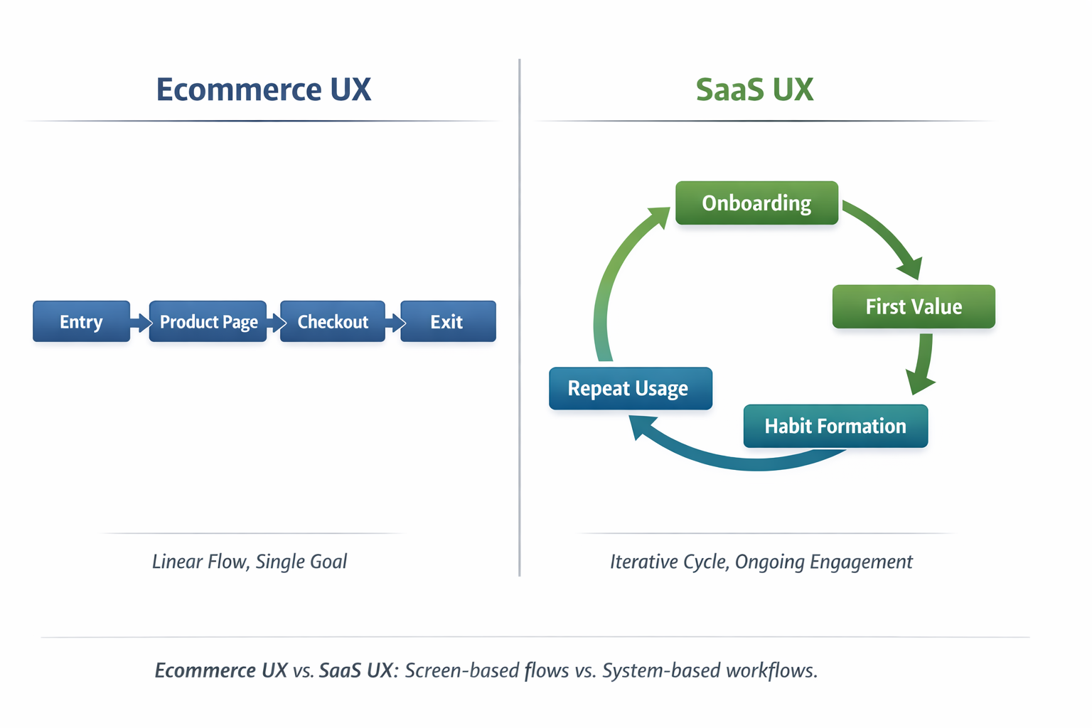
The Core Difference Most Teams Refuse to Admit
You wont belive this but this is the blunt truth most teams dance around: SaaS UX is about sustained behaviour. Ecommerce UX is about a moment.
If you don't internalise that difference, everything else downstream gets distorted.
In ecommerce UX, the optimisation target is clean and short-lived.
You're designing for entry → persuasion → conversion → exit.
The user shows up with intent, you reduce friction just enough to get the sale, and then they're gone. Success is measurable immediately. Conversion happens or it doesn't. That model makes sense for ecommerce, and when it's done well, it works.
But a SaaS UX designer is solving a completely different problem.
In SaaS, the real work starts after the first click, not before it. The optimisation path looks more like onboarding → adoption → habit formation → long-term retention.
Users don't just need to understand what the product is — they need to understand how it fits into their daily workflow, repeatedly, without friction or confusion. And that takes time, clarity, and restraint.
This is where things go wrong. Teams borrow ecommerce patterns — urgency cues, aggressive CTAs, forced progression, over-designed screens — and drop them into SaaS products.

On day one, metrics look fine. On week three, usage drops.
On month two, features go untouched. By the time churn shows up, the UX damage is already done.
Mixpanel's 2024 benchmarks underline this problem clearly: products that fail to guide users to meaningful activation within the first few sessions see a steep drop-off in engagement, with the majority of users never returning after initial use.
In other words, when users don't reach value fast and understand how to repeat it, they disappear.
That's not because users are lazy — it's because the UX was optimised for conversion instead of comprehension.
This is also why working with a full-service UI UX design agency can be risky if they don't deeply understand SaaS behaviour.
Agencies that excel at ecommerce and UX often optimise beautifully for the moment of purchase, but struggle when the product demands long-term cognitive efficiency and repeat use.
Here's the simple rule experienced designers need to live by:
If your UX success metric ends at conversion, you're not designing SaaS UX — you're designing a landing page with extra steps.
And SaaS products don't survive on moments.
They survive on habits.
Why SaaS UX Designers Think in Systems, Not Screens
Why SaaS UX Designers Think in Systems, Not Screens
This is where ecommerce UX and SaaS UX quietly split — and most teams never notice until adoption tanks.
Ecommerce rewards screen-level optimisation.
You can win by perfecting individual moments:
- A landing page that sharpens the value proposition
- A product page that removes doubt
- A checkout flow that eliminates friction
Each screen is designed to perform independently. If one page converts better, you ship it. Simple.
SaaS doesn't work that way.
A SaaS UX designer quickly learns that users don't experience features in isolation.
They experience chains of decisions, repeated over days, weeks, and months. Any friction you introduce doesn't reset at the next screen — it accumulates across the workflow.
That's why SaaS actively punishes screen-first thinking.
Mental Models Beat Page Flows Every Time
Mental Models Beat Page Flows Every Time
Ecommerce UX maps paths.
SaaS UX maps mental models.
In ecommerce, it's fine if users forget what they saw last week — they'll re-learn it in seconds.
In SaaS, forgetting how something works is deadly. If users can't form a stable mental model of the system, they hesitate, slow down, or stop using it altogether.
This is why experienced SaaS designers obsess over:
- Predictable patterns
- Reusable interaction logic
- Familiar behaviours across modules
Not because it's boring — but because recognition beats recall every single time.
Progressive Disclosure vs Aggressive Persuasion
Progressive Disclosure vs Aggressive Persuasion
Ecommerce UX thrives on persuasion:
- Urgency
- Visual emphasis
- Highlighting the "one right action"
That approach collapses in SaaS.
A SaaS product isn't convincing users to do one thing. It's helping them do the right thing at the right time, repeatedly, without thinking too hard about it.
That's where progressive disclosure wins:
- Show what's needed now
- Reveal complexity only when context demands it
- Keep advanced actions available but not dominant
Aggressive persuasion increases cognitive load. Progressive disclosure reduces it. Over time, that difference decides whether your product feels "powerful" or "exhausting."
Why Consistency Beats Novelty in SaaS Environments
Novelty performs well in ecommerce because users leave. SaaS users stay.
In SaaS, every clever interaction, custom animation, or unique pattern becomes something the user has to relearn hundreds of times. That mental tax compounds fast.
Consistency isn't a visual preference — it's a performance optimisation.
This is why mature SaaS products feel almost invisible:
- Same actions behave the same way everywhere
- Visual hierarchy doesn't change unexpectedly
- Interaction patterns don't surprise users
It's not exciting. It's efficient. And efficiency is what keeps users coming back.
A beautiful screen that increases cognitive load across the workflow is still bad UX.
If the interface looks great but forces users to stop and think more often, you didn't design a better product — you designed a prettier obstacle.
That's the difference between designing screens and designing systems.
The Time Horizon Problem (Where Ecommerce Thinking Breaks)
This is the point where ecommerce UX logic completely collapses when applied to SaaS.
Ecommerce UX Assumptions (And Why They Work There)
Ecommerce UX is built on a very specific behavioural context:
- Users arrive motivated
- Intent is high and immediate
- Friction tolerance is short but acceptable
That's why optimisation focuses on persuasion, urgency, and momentum. You're borrowing attention for a few minutes, not asking for a long-term relationship. If the experience is slightly pushy or visually loud, it usually doesn't matter — the user leaves right after conversion.
For ecommerce, that trade-off is acceptable.
For SaaS, it's disastrous.
SaaS UX Reality (What Designers Actually Have to Deal With)
A SaaS UX designer works under completely different conditions:
- Users arrive confused, skeptical, or mandated by someone else
- Motivation fluctuates daily, sometimes hourly
- Friction tolerance drops sharply after onboarding
And the data makes this painfully clear.
Mixpanel's 2024 benchmarks underline this gap:
SaaS products that fail to get users to a clear "aha moment" within the first 2–3 sessions see the majority of users disengage permanently, even if the product is objectively valuable.
Initial sign-up does not equal intent. It only means curiosity or obligation.
On top of that, industry research consistently shows that over 80% of users abandon SaaS tools within the first 90 days if the product feels mentally taxing or inconsistent.
That drop-off doesn't happen because the UI is ugly — it happens because daily usage feels like work.
Why "Delight" Is Overrated in SaaS
Delight works when exposure is brief.
In SaaS, delight decays fast.
Animations, clever interactions, and novel UI patterns feel great the first time. By the tenth time, they're friction. By the hundredth time, they're resentment.
This is why many beautifully designed SaaS products quietly fail: they optimise for first impressions, not daily efficiency.
Data from long-term product usage studies shows that users consistently prefer:
- Predictable interactions
- Familiar layouts
- Reduced decision-making
Over time, boring but reliable beats clever but surprising every single time.
Why Predictability Beats Excitement
Excitement spikes emotion. Predictability reduces effort.
In SaaS, effort is the enemy.
Every unexpected interaction forces users to:
- Re-evaluate what's happening
- Reconfirm what action is safe
- Relearn behaviour they thought they already understood
Cognitive psychology research shows that decision fatigue increases error rates and task abandonment, especially in tools used repeatedly throughout the day.
That's why SaaS products with inconsistent patterns feel "heavy," even when they're feature-light.
A full-service UI UX design agency focused on ecommerce may chase novelty because novelty converts. A SaaS UX designer avoids novelty because novelty costs attention — and attention is finite.
Why Reducing Decision Fatigue Matters More Than Visual Flair
Here's the quiet killer in SaaS UX: micro-decisions.
- Which button should I click?
- Is this safe?
- Did this action save?
- Why is this different from yesterday?
One extra decision per screen doesn't matter in ecommerce.
In SaaS, repeated dozens of times per week, it adds up fast.
Research consistently shows that even small increases in cognitive load reduce task completion and long-term retention.
That's why mature SaaS UX focuses on:
- Fewer choices
- Clear defaults
- Stable interaction patterns
Not because designers lack creativity — but because mental efficiency keeps products alive.
Ecommerce UX borrows attention.
SaaS UX consumes it — every day.
If your design approach assumes users are always motivated, always focused, and always willing to learn something new, you're designing for the wrong time horizon.
And time horizon, more than visuals, is what separates ecommerce UX from real SaaS UX.
Read this article: : Top 6 AI-Powered Project Management Tools To Use In 2023
Metrics - The Silent UX Killer
This is where most teams lie to themselves — often without realising it.
On the surface, the dashboards look healthy. Numbers are green. Reports get shared. Leadership feels reassured. But underneath, the UX is quietly eroding.
The problem isn't analytics.
The problem is what teams choose to measure.
Metrics - The Silent UX Killer
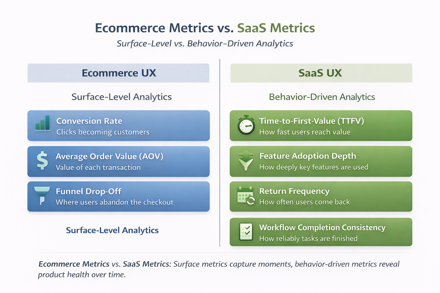
Ecommerce Metrics Make Sense — In Ecommerce
In ecommerce UX, success is intentionally narrow and immediate.
Metrics like:
- Conversion rate
- Average Order Value (AOV)
- Funnel drop-off
work because the user journey is short, transactional, and disposable. If the funnel converts today, the UX did its job. There's no expectation of long-term behaviour change.
That logic does not survive contact with SaaS.
SaaS UX Metrics That Actually Matter
A SaaS UX designer cares about what happens after the first success moment — not just whether it happened.
The metrics that correlate with real product health are:
- Time-to-first-value (TTFV)
- Feature adoption depth
- Return frequency
- Workflow completion consistency
And the data strongly supports this shift.
Mixpanel's 2024 benchmarks underline this clearly:
SaaS products that reduce time-to-first-value to the first 1–2 sessions see significantly higher retention across 30, 60, and 90 days. Products that delay value — even if they convert well — experience steep drop-off shortly after onboarding.
In other words: early conversion ≠ early value.
Feature Adoption: The Metric Most Teams Avoid
Here's an uncomfortable stat designers should internalise:
Pendo's product usage research consistently shows that 60–80% of SaaS features go unused.
That's not a roadmap problem.
That's a UX clarity problem.
Dashboards may show:
- Active users
- Feature availability
- Session counts
But they rarely show:
- Which features users actually rely on
- Which workflows are avoided
- Where users create external workarounds
This is how structural UX debt hides behind surface-level success.
Why Analytics Dashboards Mislead Designers
Most analytics tools are event-first, not behaviour-first.
They answer questions like:
- Did the user click this?
- Did they reach this screen?
- Did they complete this step once?
They do not answer:
- Can the user repeat this without thinking?
- Do they trust the system enough to rely on it?
- Does the workflow hold up under daily use?
As Nielsen Norman Group has repeatedly pointed out, usage frequency and task repeatability are stronger indicators of UX quality than isolated task completion. One successful interaction means nothing if it's never repeated.
The "Green Metrics" Trap
This is where UX teams get burned.
- Conversion rate is up
- Onboarding completion is high
- Engagement charts look stable
Meanwhile:
- Core features are ignored
- Support tickets quietly increase
- Users revert to spreadsheets, email, or Slack
The product looks healthy — but only because the metrics aren't designed to surface friction.
A full-service UI UX design agency focused on ecommerce outcomes may stop here. A SaaS UX designer can't afford to.
What Skilled Designers Should Challenge
Senior designers need to push back on:
- Dashboards that celebrate activation without retention
- "Feature shipped" being confused with "feature adopted"
- One-time success being treated as long-term usability
Because the most dangerous UX failures don't show up as red alerts.
They show up as slow disengagement.
If your metrics can't tell you:
- whether users rely on your product
- whether workflows get easier over time
- whether behaviour stabilises
then your UX health is unknowable — no matter how green the dashboard looks.
And that's why metrics, more than visuals, quietly decide whether SaaS products survive.
Onboarding Is Not a Funnel (And Treating It Like One Is Lazy)
Most onboarding experiences fail because they're designed like marketing funnels, not product entry points. That mistake usually comes from borrowing ecommerce thinking where it doesn't belong.
In ecommerce, onboarding is optional. Users can browse, bounce, or buy without ever learning how the system works. If they leave, nothing breaks.
In subscription software, onboarding is existential. If users don't understand how to get value quickly, they don't "browse" — they disengage, stall, or abandon the product entirely.
This is where many digital product teams quietly sabotage themselves.
Why Checklists Alone Don't Create Understanding
Onboarding checklists are popular because they're easy to measure, not because they're effective.
Checklists:
- Encourage task completion without comprehension
- Create a false sense of progress
- Optimise for "done" instead of "understood"
Users can complete every step and still have no idea how the product fits into their real work. When that happens, usage drops the moment guidance disappears.
Completion is not confidence.
Why "Tooltips Everywhere" Signal a Design Problem
Excessive tooltips are rarely a UX enhancement. They're usually a symptom.
When a product relies on constant micro-explanations, it often means:
- Core concepts weren't made obvious through structure
- Interface decisions require explanation instead of recognition
- Users are being asked to learn the UI instead of achieve outcomes
Tooltips should clarify edge cases, not carry the weight of basic understanding. If users need to hover, click, or dismiss instructions just to move forward, cognitive load spikes fast.
Teaching Features vs Teaching Outcomes
This is the most important distinction experienced designers need to make.
Many onboarding flows focus on:
- Where buttons are
- What each feature does
- How many tools exist
Effective onboarding focuses on:
- What problem the user can now solve
- When to use the product in their workflow
- How success looks after today, not just now
Users don't retain feature knowledge.
They retain outcomes they've personally achieved.
What Effective Onboarding Actually Does
trong onboarding doesn't explain the interface — it removes uncertainty.
That means it should:
- Make the first successful action obvious
- Reduce fear of "doing something wrong"
- Show progress toward a meaningful result
- Establish trust that the system behaves predictably
When users feel safe and oriented, they explore naturally. When they feel unsure, they freeze — no matter how many prompts you add.
A Hard Truth Most Teams Avoid
If users need:
- Long walkthroughs
- Mandatory training sessions
- External video tutorials just to get started
Then onboarding already failed once — before the first login.
Training should deepen mastery, not compensate for unclear product design.
Onboarding isn't about guiding users through screens.
It's about helping them cross the gap from curiosity to confidence.
Treat it like a funnel, and you optimise for movement.
Treat it like a foundation, and you optimise for momentum.
Only one of those survives real-world usage.
Why SaaS UX Designers Pay Attention to What Doesn't Happen
In transactional products, success is loud.
Actions are visible, measurable, and immediate. If users click, convert, or complete a purchase, the UX did its job.
That mindset doesn't translate to long-term software products.
In commerce-focused UX, teams celebrate obvious signals:
- Click-throughs
- Add-to-cart actions
- Completed purchases
Those events are clear, intentional, and easy to track.
In subscription-based software, the real signals are quieter — and far more dangerous to ignore.
Experienced product designers learn to watch for absence, not activity.
The Signals SaaS UX Designers Actually Track
Instead of asking "What did users click?", SaaS UX asks:
- Which capabilities are never discovered
- Which actions users consistently avoid
- Which workflows users abandon halfway through
Silence is data.
When features exist but aren't touched, it usually means:
- The value isn't obvious
- The mental model doesn't hold
- The effort outweighs the perceived benefit
None of that shows up in basic usage metrics.
The Red Flags That Appear Outside the Product
When the interface doesn't support real work, users don't complain — they improvise.
That's when you start seeing:
- Shadow workflows built without product awareness
- Spreadsheet escapes to manage tasks the system technically supports
- Messaging tools filling functional gaps the product should cover
These aren't edge cases. They're survival tactics.
And once they form, users rarely come back to the "official" workflow.
Why This Is a Senior-Level UX Problem
Junior teams optimise what they can see.
Senior designers investigate what's missing.
Understanding why users avoid certain paths requires:
- Contextual user research
- Workflow observation
- Pattern recognition across teams, not sessions
This is where UX maturity shows up — not in polished interfaces, but in preventing quiet abandonment.
The Reality Check
If users are solving problems around your product instead of inside it, the UX didn't fail loudly — it failed structurally.
And spotting that early is what separates surface-level UX work from real SaaS product design.
That's where experienced designers earn their keep.
The Uncomfortable Truth: Most Ecommerce UX Expertise Doesn't Transfer Cleanly
This is the part many teams avoid saying out loud.
A lot of ecommerce UX expertise is genuinely valuable.
Pattern recognition, visual hierarchy, friction reduction, persuasion mechanics — these are not useless skills. The problem starts when those patterns are copied into SaaS products without adjusting for context, time horizon, and user psychology.
What works in ecommerce often works because the relationship is short.
The user arrives, completes a task, and leaves. In SaaS, that same approach quietly creates friction that compounds over weeks and months. The UX doesn't break immediately — it erodes trust over time.
This is why experienced SaaS designers often feel friction when ecommerce-led thinking dominates product decisions. It's not about taste. It's about consequences.
The Patterns SaaS UX Designers Have to Unlearn
Over-persuasion is one of the first habits that needs to go. In ecommerce, persuasion drives action.
In SaaS, persuasion repeated daily becomes pressure. When every screen pushes, nudges, or demands attention, users stop trusting the interface. They hesitate instead of acting.
Forced progression is another common carryover.
Ecommerce funnels are designed to move users forward whether they fully understand the product or not. In SaaS, forcing users through steps they don't yet understand creates false progress.
Users advance, but comprehension doesn't. That gap always shows up later as misuse, avoidance, or churn.
Artificial urgency is the most damaging of all. Countdown timers, aggressive prompts, and fear-based messaging work in transactional environments because the cost of a bad decision is low.
In SaaS, urgency backfires. Users are making decisions that affect their work, their data, and often their team. When the interface rushes them, trust breaks.
Why Trust Replaces Persuasion in SaaS UX
SaaS products don't win by convincing users to act once. They win by becoming something users rely on without thinking.
Trust forms when the interface behaves predictably, communicates intent clearly, and doesn't surprise users at the wrong moments. That trust allows users to move faster over time.
Persuasion does the opposite. It introduces doubt, hesitation, and second-guessing.
Experienced SaaS UX designers design to remove fear, not to create momentum. Momentum follows trust naturally.
Why Clarity Replaces Conversion Tricks
Conversion tactics are designed to collapse decision-making. SaaS UX is designed to support it.
Clear structure, obvious defaults, and consistent behaviour matter more than clever UI patterns.
When users understand what will happen before they act, they act more often — and more confidently.
This is why mature SaaS interfaces often feel almost boring. They're not trying to impress. They're trying to stay out of the way.
Why SaaS UX Failures Cost Months, Not Moments
When ecommerce UX fails, you lose a sale.
When SaaS UX fails, users don't always leave immediately.
They adapt. They work around the product. They use only a fraction of its capability. They rely on external tools. Eventually, someone questions why the software is still worth paying for.
That process takes time. Which makes the failure harder to spot — and far more expensive.
This is why blindly transferring ecommerce UX expertise into SaaS environments is risky. Not because the skills are bad, but because the context is unforgiving.
SaaS doesn't punish you instantly.
It lets the damage accumulate quietly.
And by the time it's visible, it's already embedded in the product.
What Skilled Designers Should Do Differently Moving Forward
At a senior level, the difference isn't taste or tools — it's what you choose to optimise for. Most UX problems in SaaS don't come from bad intentions. They come from applying the wrong optimisation logic at the wrong time.
If you're designing long-lived products, a few mindset shifts matter more than any framework.
First, design for repeat usage before edge cases. Early design discussions often get hijacked by rare scenarios, exceptions, or "what if" situations. In SaaS, that's backwards.
If the core workflow isn't effortless on the tenth, fiftieth, or hundredth use, edge cases don't matter. Optimise the paths users walk every day before you worry about the ones they might never hit.
Second, map workflows, not pages. Pages are implementation details. Workflows are what users actually experience.
When design reviews focus on screens in isolation, friction hides between them. Skilled designers step back and ask how actions connect over time, how state carries forward, and where cognitive load stacks up across the system.
Third, validate success weeks after release, not on launch day. Launch metrics are deceptive. Early usage often reflects novelty, guidance, or forced adoption.
Real UX quality shows up later, when prompts disappear and users decide whether the product is worth the effort. Designers need to evaluate behaviour after the safety net is gone.
Fourth, push back on stakeholders chasing vanity metrics. High activation, rising click counts, or onboarding completion rates feel reassuring, but they don't guarantee usability.
Senior designers are responsible for reframing success around sustained behaviour, not short-term activity. That often means uncomfortable conversations — and having them anyway.
Finally, document UX decisions like architectural decisions. In SaaS, UX choices shape how people work every day. They introduce constraints, dependencies, and long-term consequences.
Treating them as disposable visuals instead of structural decisions is how products accumulate invisible UX debt.
How SaaS-Focused UX Differs in Practice
| Design Focus Area | Common Practice | Skilled SaaS UX Approach |
| Primary Goal | Optimise first-time success | Optimise repeat, effortless usage |
| Design Unit | Individual screens | End-to-end workflows |
| Success Timing | Launch-day metrics | Behaviour weeks after release |
| Metrics Emphasis | Activation, clicks, completion | Adoption depth, consistency, reliance |
| Stakeholder Pressure | Accept vanity metrics | Challenge and reframe success |
| UX Documentation | Visual specs and tickets | Rationale, trade-offs, long-term impact |
None of this is glamorous. It doesn't show up in screenshots. It doesn't trend on social feeds.
But this is the work that keeps SaaS products usable at scale.
Skilled designers don't just make things clearer — they make products survivable over time.
This Isn't About Being "Better" — It's About Being Honest
Designing for long-term software products is harder than designing for transactions.
It's slower, less visually rewarding, and far less likely to produce quick wins that look good in a deck.
Product UX work demands patience, structural thinking, and a willingness to trade short-term excitement for long-term usability. That's not glamorous work — but it's the work that keeps products alive.
Mature product design rewards restraint.
Clear information architecture, predictable interaction patterns, and consistent behaviour matter more than clever layouts or trendy components.
Over time, these decisions reduce friction, lower cognitive effort, and allow users to operate on instinct instead of memory. That's where real efficiency comes from — not from novelty, but from stability.
Designers who make this shift stop chasing reusable patterns and start shaping durable systems. They think less about how an interface looks in isolation and more about how it behaves under daily pressure.
They focus on workflow design, interaction consistency, and long-term adoption instead of one-off engagement spikes.
And if you've ever felt that ecommerce UX rules were quietly sabotaging your product, you weren't wrong.
You were just designing for the wrong time horizon.
Most Popular Posts

Effective communication among team members is vital for the productivity and success of any organization. Surprisingly, 60% of companies lack a long-term internal communication strategy, which p...


Businesses thrive on communication for efficiency, productivity and accomplishment. When the right information is passed from the right designation in the organization, it promotes positivity an...
Categories
Blog
(2918)
Business Management
(363)
Employee Engagement
(221)
Digital Transformation
(189)
Growth
(139)
Intranets
(133)
Remote Work
(63)
Sales
(52)
Collaboration
(46)
Customer Experience
(29)
Culture
(29)
Knowledge Management
(28)
Project management
(28)
Leadership
(20)
Comparisons
(9)
News
(1)

Related Posts

What Is Portal Software? Have you ever wondered why so many businesses struggle with disconnected systems, scattered documents, outdated intranets, and poor communication between teams? Most organisations today rely on dozens of different tools...

What happens when your systems suddenly stop working in the middle of a busy workday? For growing businesses, downtime is no longer just a technical problem — it is a direct threat to productivity, customer trust, revenue, and daily operations. ...

Despite organisations investing heavily in collaboration platforms, employee apps, and hybrid work technology, many businesses still struggle with disconnected communication, low employee engagement, and poor workforce visibility. According to ...

The communication champion role is a valuable addition to any business. In a large organization, communication champions should be numerous, forming a communication network. They keep track of information and assist others in better collaborating, wo...

Featured
In today's fast-paced hybrid work environment, staying connected isn't just nice—it's necessary. With more than 80% of employees now working remotely at least part of the time, the demand for intuitive, powerful collaboration tools has never be...


Jill Romford
I am a digital nomad, lover of exploring new places and making friends.
I love to travel and I love the internet. I take pictures of my travels and share them on the internet using Instagram.
Traveler, entrepreneur, and community builder. I share my insights on digital marketing and social media while inspiring you to live your fullest life.
Ready to learn more? 👍
One platform to optimize, manage and track all of your teams. Your new digital workplace is a click away. 🚀
Free for 14 days, no credit card required.