Insight Blog
Agility’s perspectives on transforming the employee's experience throughout remote transformation using connected enterprise tools.
12 minutes reading time
(2453 words)
Website Header Design in 2023: 7 Best Practices + 6 Great Examples

Website Header Design in 2023: 7 Best Practices + 6 Great Examples
A website header is a navigation menu that appears on top of your page. It's the first impression that your website gives to your visitor. But what are the best header designs coming in 2023.
Website Header Design in 2023: 7 Best Practices + 6 Great Examples

A website's header is the section of the homepage above the fold — it's not just the narrow menu at the very top of the page.
Think of it as your brand's digital calling card. If you design it well, you will see more conversions. If you make it confusing and don't match it to your audience's needs and interests, you will see an increased bounce rate.
Here are seven best header design practices to consider, along with some great examples to take inspiration from.
What Makes a Good Header?
What Makes a Good Header?
Before we take a look at some examples, let's first discuss what you need to put into your header menu.
By meeting these criteria, a good header in a website can effectively communicate the identity of the brand, provide clear navigation, establish the tone and style of the website, and be visually appealing.
Brand Logo
Your header must contain your logo or brand identifier. You can spell out the name of your brand, and you can use a smaller or larger logo. Whatever you do, just make sure it's very clear who you are.
Here are some tips for producing a good logo:
- Define your brand and target audience: Before you start designing your logo, it's important to have a clear understanding of your brand and target audience. This will help you create a logo that resonates with your intended audience and effectively represents your brand.
- Research your industry and competitors: Look at the logos of your competitors and other businesses in your industry to get an idea of what has been done before and what trends are currently popular. You should also consider what makes your business unique and how you can differentiate your logo from others in your industry.
- Consider the design elements: Think about the colors, font, and imagery you will use in your logo. Choose colors that reflect your brand and are visually appealing, and select a font that is clear and easy to read. The imagery should be simple and memorable, and should accurately represent your brand.
- Test and revise: Create multiple design options and get feedback from others, including your target audience. Use this feedback to refine your design until you have a logo that effectively represents your brand and resonates with your target audience. For starters, using a reliable logo maker can provide you with a variety of design options to gather feedback on.
Read more on branding: The Business Side of Branding: How The Boardroom Should Approach Their Brand
Navigational Elements
Your menu needs to contain all the navigational links that a user may need. While there are certain ones you can place in your footer alone (like your terms of service and privacy policy), make sure that all of your categories, about page, and contact page can be reached easily from the top menu.
- Keep it simple: A simple and intuitive navigation structure is easier for users to understand and use. Avoid using too many levels or categories, and try to group related pages together.
- Use clear and descriptive labels: The labels for your navigation links should be clear and descriptive, so users know exactly where each link will take them. Avoid using vague or ambiguous terms.
- Use consistent language and structure: Use consistent language and structure throughout your navigation to help users understand the hierarchy of your website. This includes using the same terms for similar pages and using a consistent navigation structure on every page of your website.
- Consider the user's needs: Think about what users might be looking for on your website and make sure that your navigation reflects those needs. For example, if you have a shopping website, users will likely be looking for categories such as "products," "prices," and "shopping cart."
- Make it easy to access: Place your navigation in a prominent location on your website, such as the top or left-hand side of the page, so it is easy for users to find and use.
By following these tips, you can create a good navigation on your website that is simple, clear, and easy to use.
Search Box
Ideally, you also want to feature a search box in the top menu, as this will help visitors who are looking for a specific product find what they need quickly. Make sure the search actually works and that you've labeled and tagged all of your pages with the appropriate words and phrases.
There are several benefits to having a search feature on a website:
- Improved user experience: A search feature allows users to quickly and easily find the content they are looking for, improving their overall experience on the website.
- Increased engagement: A search feature encourages users to explore the website and discover new content, increasing their engagement with the site.
- Increased conversions: A search feature can help users find the specific products or services they are looking for, increasing the likelihood of a conversion.
- Better organization: A search feature allows users to easily find specific content within a large website, improving the organization of the site.
- Enhanced data collection: A search feature can provide valuable data on the terms and phrases users are searching for, which can be used to improve the website and inform marketing efforts.
Overall, a search feature on a website can improve the user experience, increase engagement and conversions, and provide valuable data for the website owner.
Social Network Links
You can also choose to feature your social media profile links in the header. Some websites only feature them in the footer, and there is no right or wrong way to do it. It's up to your personal choice and the design layout of the page.
It is generally a good idea to include social links in the header of your website. This makes it easy for users to find and follow your social media profiles, and can help drive traffic to your social media pages.
However, you should also consider the overall design and layout of your website, as well as your target audience and their preferences. If your website has a lot of other elements in the header, adding social links may clutter the design or distract from other important information.
Additionally, if your target audience is not particularly active on social media, or if your business does not have a strong presence on social media, it may not be necessary to include social links in the header.
In general, including social links in the header can be a useful way to connect with users and drive traffic to your social media profiles, but it's important to consider the specific needs and goals of your website and target audience.
Contact details
The same applies to your contact details. You can feature your phone number and email in the footer only, but it's better practice to add them to the header as well. This will cut down on the time users need to get in touch with you, making for better UX.
Having contact details in the header also makes it more convenient for users to reach out to you if they have questions or concerns. This can be especially important if your website is selling products or services, as it helps to build trust and establish a relationship with potential customers.
In general, including contact details in the header can be a useful way to connect with users and build trust, but it's important to consider the specific needs and goals of your website and target audience.
Tagline
Your header should also contain a tagline: one or two sentences that describe what you offer and why your audience should be interested in converting.
A good tagline will focus on the benefits for the audience and not on the features of your product or service. It will also be short, to the point, and easy to understand.
A website tagline is a short, memorable phrase that summarizes the main purpose or focus of a website. It is often displayed prominently on the homepage or in the website's header, and is used to give visitors a quick and clear understanding of what the website is all about.
Website taglines should be concise and easy to understand, and should accurately reflect the content and purpose of the website. They should also be memorable and catchy, in order to help visitors remember the website and distinguish it from others in the same industry.
Some examples of well-known website taglines include "Just Do It" for Nike, "Think Different" for Apple, and "Because You're Worth It" for L'Oreal.
Overall, a website tagline is a useful tool for communicating the purpose and focus of a website to visitors in a clear and memorable way.
Call to Action
Finally, you also need to incorporate at least one call to action. You can have two if there are two distinct actions users can take (for example, sign up for a free trial or book a demo call).
A call to action (CTA) on a website is a button, link, or other type of element that prompts visitors to take a specific action, such as signing up for a newsletter, making a purchase, or filling out a form.
CTAs are often used to guide visitors towards the next step in the conversion process, and can be an effective way to increase conversions and drive business goals.
To be effective, a CTA should be clearly visible and easy to find, and should use language that clearly communicates the action the visitor should take. It should also be placed in a strategic location on the website, such as near the top of the page or in the center of the screen, where it is likely to be noticed.
Overall, a CTA is a useful tool for guiding visitors towards a specific action and driving conversions on a website.
The call to action needs to be as short as possible and clear. Try to be more compelling than "click here" and "buy now."
Example 1: The Mega Menu
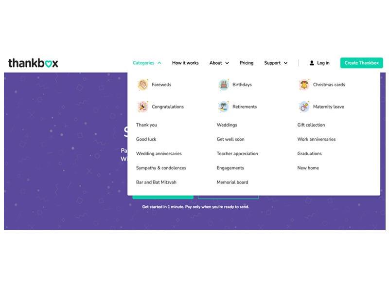
Source: thankbox.com
The mega menu is making a comeback, especially on retail websites or those offering a large number of different options. They provide better UX as they enable instant access to all the relevant information.
While they need to be somewhat limited on mobile (never leave your entire mega menu available on small screens!), simply prioritizing your categories can work too.
ThankBox solved it well with their large selection of different categories you can easily look over on desktop. They've clearly highlighted the most popular ones by adding logos to them.
Example 2: The Left-Aligned Header
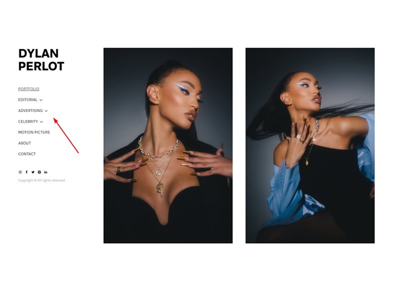
Source: dylanperlot.com
Aligning your menu to the left-hand side of the screen is a great way to stand out among your competition. As long as you keep the logo in the top left corner, users will naturally understand where they need to navigate next.
This will usually not work on large websites, but smaller brands can capitalize on this design solution.
Dylan Perlot's portfolio website is a great example of this trend. There is no traditional header and footer, and all of the important navigational information is on the left. The social media links are also there, and the visitor can take in all the stunning imagery that forms the core of the website without any distractions.
Example 3: The Minimal Menu
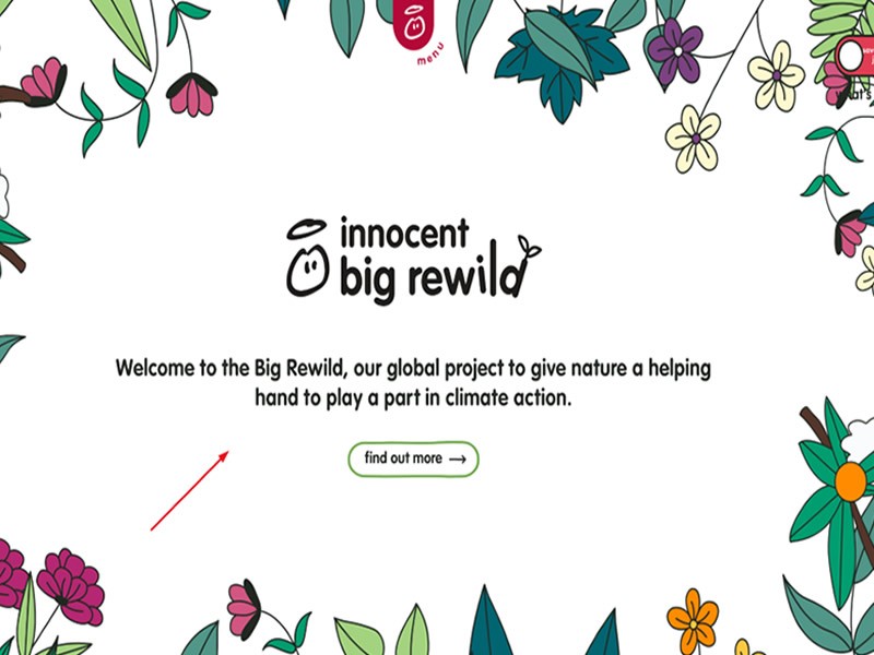
Source: innocentdrinks.co.uk
Sometimes you want the hero section of your page to be the one that does all the talking. In this case, the menu can be entirely hidden and reachable via a mobile-like icon. It works on desktop because most visitors are also mobile users and know where to look for a menu if it's not clearly visible.
This allows you to focus on the messaging of the core header. Innocent does it with a message and plenty of color, but you can do it with a video or with a striking photo too.
Example 4: The Catchy Tagline
The purpose of the header is to grab the attention of your visitors. The best way to do that is often with a very catchy tagline that will resonate with them. You can be funny, or you can be a tiny bit confusing or controversial, as long as you make it quite clear what your intentions are.
SomniFix, for example, says: "Don't be a mouth breather." They are clearly not trying to offend their visitors. They merely want to draw their attention in so that they can explain the effects of breathing through your mouth and how they can help you prevent it in the future.
Example 5: The Video Header
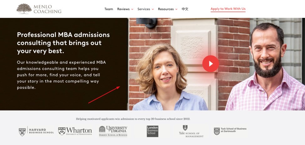
Source: menlocoaching.com
Video is a great way to grab the attention of your audience in your header, especially if they fall into the category of those who'd rather watch than read. Video also allows you to communicate more messages in less time and in more dimensions than just using words.
Make sure the video does not autoplay, however, unless you only play it on a small part of the screen. Especially make sure that the sound does not play automatically. You never know what your visitors are doing in real life while browsing your website.
Menlo Coaching did a great job. They have an optional video in the header, which will open up in full screen only when you click on it. They give their visitors the choice of watching it at their leisure, perhaps even after they've looked at the rest of your page.
Example 6: The Easy to Navigate
The best headers are the ones that are simple, clear, and very easy to navigate. No extra thrills, just a clear message with a simple menu.
That's what ATH did. They regularly swap out their header image to highlight their latest deals, and the menu itself provides all the direction a visitor may need. There is nothing extremely engaging about it, but it works precisely because of that.
Remember that most of your visitors want to spend as little time on your website as possible and get on with their day. Make that possible with a simple header.
Wrapping up
Consider these header design trends if you are looking to revamp your website for 2023 and beyond. What do you think: which one would your target audience appreciate the most?
Most Popular Posts

Effective communication among team members is vital for the productivity and success of any organization. Surprisingly, 60% of companies lack a long-term internal communication strategy, which p...


Businesses thrive on communication for efficiency, productivity and accomplishment. When the right information is passed from the right designation in the organization, it promotes positivity an...
Categories
Blog
(3012)
Business Management
(380)
Employee Engagement
(225)
Digital Transformation
(194)
Growth
(143)
Intranets
(137)
Remote Work
(63)
Sales
(53)
Collaboration
(48)
Customer Experience
(30)
Culture
(30)
Project management
(29)
Knowledge Management
(28)
Leadership
(20)
Comparisons
(9)
News
(1)

Related Posts

Generative AI has rapidly moved from trend to transformative force, reshaping industries across the board. But perhaps its most visible impact has been in the marketing world—streamlining everything from ad creation to email copywriting in seco...

Many businesses still rely on software that was built 10, 15, or even 20 years ago. At first glance, these systems may seem cost-effective because they are already paid for and deeply embedded into daily operations. However, beneath the s...
")
Artificial intelligence is everywhere right now. From employee communication platforms and HR software to project management tools and company knowledge bases, businesses are racing to add AI to their workplace technology stack. The promise is ...

Launching a startup is exciting, but it can also be expensive if you build the wrong product. That's why many founders choose to start with a Minimum Viable Product (MVP) before committing significant time and money to full-scale development. A...

Walk into almost any workplace today and you'll find employees juggling a growing number of tools. One platform for chat, another for project management, a separate HR system, multiple document repositories, and countless email chains just to g...


Jill Romford
I am a digital nomad, lover of exploring new places and making friends.
I love to travel and I love the internet. I take pictures of my travels and share them on the internet using Instagram.
Traveler, entrepreneur, and community builder. I share my insights on digital marketing and social media while inspiring you to live your fullest life.
Ready to learn more? 👍
One platform to optimize, manage and track all of your teams. Your new digital workplace is a click away. 🚀
Free for 14 days, no credit card required.