Insight Blog
Agility’s perspectives on transforming the employee's experience throughout remote transformation using connected enterprise tools.
21 minutes reading time
(4169 words)
Menu Hierarchy Design & Navigation Flow UX For Intranets

Menu Hierarchy Design & Navigation Flow UX For Intranets
Create a user-friendly intranet with an effective menu hierarchy design and navigation flow UX. Learn about visual hierarchy, user testing, and more.
Menu Hierarchy Design & Navigation Flow UX For Intranets

Discover the ultimate guide on menu hierarchy design and navigation flow UX for intranets!
In this article, you'll learn the importance of creating a user-friendly intranet. We'll cover key concepts like menu hierarchy design, navigation flow, and information architecture.
Plus, we'll compare different types of navigation and share tips on designing a great navigation bar.
By the end, you'll be ready to build a fantastic intranet that's easy to use for everyone. Let's dive in!
Key Takeaways
- Effective menu hierarchy design improves user experience on intranets.
- Navigation flow UX is crucial to guide users through a seamless journey.
- Intranet information architecture should be based on user needs and well-organized.
- Choosing the right type of navigation and designing a navigation bar is key.
- Visual hierarchy and user testing can help improve intranet navigation over time.
What is Menu Hierarchy Design?
Menu Hierarchy Design
A menu hierarchy design is a way to organize and structure the options in a menu, making it easy for users to find and access different sections or features within a website or application.
This arrangement groups related items together and present them logically, creating a clear and user-friendly navigation experience.
Menu Hierarchy Design – A Complete Guide
Visual hierarchy is crucial in menu hierarchy design because it helps users quickly understand the organization and structure of the menu, making it easier for them to find and access the information or features they're looking for. A well-designed visual hierarchy guides users' attention by emphasizing certain elements in the menu, such as headings or essential features. This allows users to identify critical sections and navigate more efficiently and easily.
Additionally, the menu hierarchy design improves readability by organizing menu items with clear headings, groupings, and consistent formatting. This helps users quickly scan the menu and find what they need without feeling overwhelmed. A visually appealing and logically structured menu enhances the overall user experience, making users more likely to engage with the website or application and return in the future.
A menu hierarchy design also reduces confusion and frustration by preventing users from getting lost or confused, minimizing the likelihood of them giving up or feeling frustrated with the navigation process. Overall, a strong visual hierarchy in menu design is crucial for creating a user-friendly and efficient navigation experience that keeps users engaged and satisfied.
Key benefits of visual hierarchy in menu design:
- Guides users' attention
- Improves readability
- Enhances user experience
- Reduces confusion and frustration
You can create a more enjoyable and efficient user experience by incorporating menu hierarchy design into your menu design. Implementing a menu hierarchy design simplifies navigation and encourages users to explore your website or application further, increasing engagement and user satisfaction.
Leverage Menu Hierarchy Design Effectively with These Practical Tips for Your Menu Design
Tips for creating an effective menu hierarchy design:
- Use size, color, and typography to emphasize important menu items or headings, guiding users to key sections.
- Create clear groupings by separating related items with whitespace, lines, or background colors, making it easier for users to identify distinct sections.
- Maintaining consistency in fonts, colors, and styling for similar items or categories enhances the menu's overall readability and aesthetic appeal.
- Design with accessibility in mind, ensuring that users with varying visual or cognitive abilities can easily navigate your website or application.
By focusing on menu hierarchy design, you can create a well-organized and visually appealing menu that guides users and contributes to a positive user experience. This, in turn, can lead to increased user retention, better engagement, and a higher likelihood of recommendations to others. Remember, a clear and functional menu design is the cornerstone of an effective and user-friendly intranet.
Menu Design Visual Hierarchy – How It Works?
Menu Design Visual Hierarchy
Creating an engaging and effective menu hierarchy design for an intranet is essential for a user-friendly navigation experience. To ensure your menu design stands out and helps users effortlessly navigate your website or application, focus on these three crucial elements:
1. Clear labels
Opt for concise and descriptive labels that accurately represent the content or functionality within each section. This enables users to quickly understand each menu item's purpose, making navigation more intuitive.
2. Grouping related items
Organize similar content or features together, creating a logical structure that helps users find what they're looking for with ease. Thoughtful grouping reduces cognitive load and enhances the menu's visual appeal.
3. Consistent placement
Maintain the same placement for menu items and categories throughout your website or application. Consistency helps users develop a mental model of the menu structure, allowing them to navigate more efficiently and confidently.
By incorporating these key elements in your menu hierarchy design, you can ensure a seamless and enjoyable user experience, ultimately leading to increased engagement, satisfaction, and user retention.
Navigation Flow & Bar UX For Intranets
Navigation Flow UX
Definition of Navigation Flow UX
Navigation flow UX (User Experience) refers to the process of designing and structuring an intranet or website in a way that allows users to move through the content and features efficiently and intuitively.
It focuses on the paths users take to accomplish their goals, the visual cues that guide them, and the overall ease of navigating the platform.
Definition of Flow UX
Flow UX, also known as navigation flow, refers to the process of guiding users through a digital product or website in a seamless and intuitive manner. It involves creating a clear and logical path for users to follow, allowing them to easily find and access the information or features they need without getting lost or frustrated.
Flow UX is often achieved through effective menu design, page layout, and the use of intuitive navigation elements such as buttons, links, and search bars.
Importance of Navigation Flow UX for Intranets
Navigation Bar UX
For intranets, navigation flow UX is particularly important due to the following reasons:
- Enhances productivity: A well-designed navigation flow allows users to find the information or tools they need quickly, boosting their productivity and efficiency.
- Increases user satisfaction: A seamless navigation experience leads to higher user satisfaction, encouraging employees to use the intranet regularly and effectively.
- Reduces user frustration: Poor navigation can lead to confusion and frustration, negatively impacting user engagement and adoption. Good navigation flow UX minimizes these issues.
- Supports diverse user needs: Intranets cater to users with different roles, tasks, and technical expertise. An intuitive navigation flow ensures that all users can access the required information and tools.
Key Concepts Navigation Flow UX
Here are the key concepts of navigation flow UX:
User Journey
The user journey refers to the sequence of steps users take while interacting with modern intranet, from accessing content to completing specific tasks. A well-designed user journey takes into account users' goals, expectations, and pain points, ensuring that the navigation process is smooth and efficient. To create an effective user journey, it is essential to understand users' needs and preferences through research and testing.
Wayfinding
Wayfinding is the process of designing clear and easily understandable pathways for users to navigate the intranet. Good wayfinding helps users to quickly identify their current location within the intranet, understand the available navigation options, and reach their desired destination without confusion. Wayfinding techniques include providing clear headings, breadcrumb trails, and a consistent menu structure.
Signifiers
Signifiers are visual cues or elements that help users understand how to interact with the intranet. They indicate which elements are interactive, such as clickable buttons or links, and guide users in making appropriate choices. Effective use of signifiers helps users navigate the intranet with ease and confidence, minimizing the risk of errors or frustration. Examples of signifiers include color, shape, size, and icons that communicate the function of a specific element.
By understanding navigation flow UX and incorporating these key concepts into your intranet design, you can create a user-friendly, efficient, and enjoyable platform for all users.
Designing a Navigation Bar UX
The navigation bar is a crucial aspect of a website or intranet's user experience. A well-designed navigation bar can improve usability, simplify navigation, and make it easier for users to find the content they need.
To create an effective navigation bar, designers must consider its key components and ensure that it is simple, responsive, and accessible.
Importance of a Well-Designed Navigation Bar UX
A well-designed navigation bar is essential for a positive user experience. It enables users to quickly and easily find the information they need, reducing frustration and improving usability.
A navigation bar also serves as a visual guide to the website's or intranet's content, making it easier for users to understand its structure and organization.
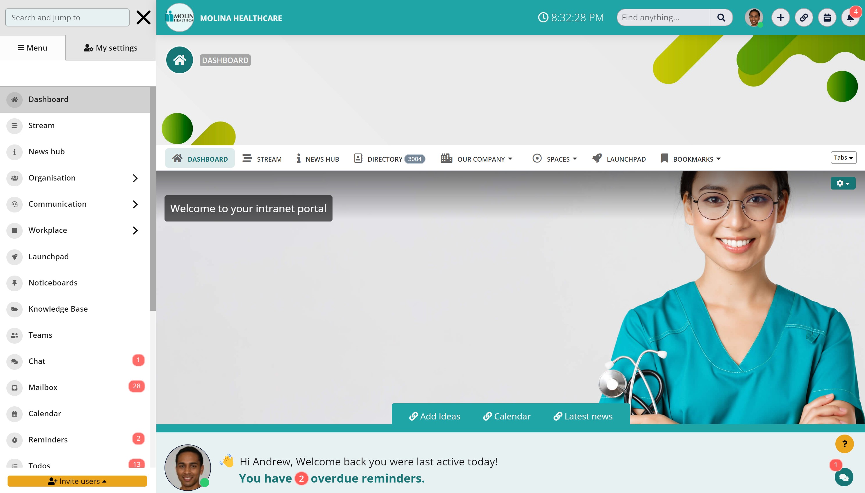
Key Components of a Navigation Bar UX
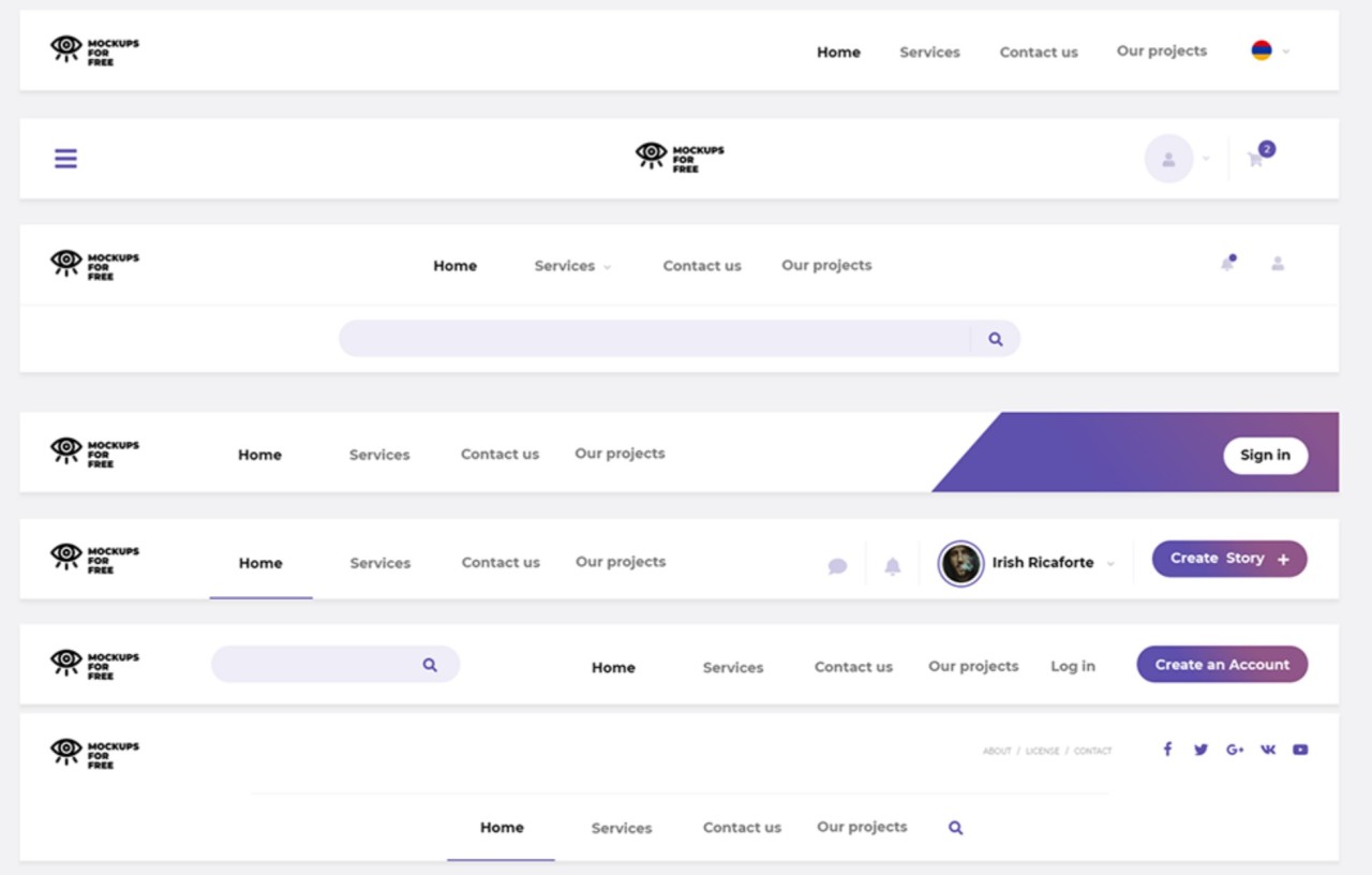
A navigation bar typically consists of four key components: a logo, menu items, a search bar, and user tools.
1. Logo
The logo is typically placed in the top left-hand corner of the navigation bar and serves as a visual anchor for the website or intranet. It should be clearly visible and identifiable, and clicking on it should take users back to the homepage.
2. Menu Items
Menu items are the links that enable users to navigate through the website or intranet's content. They should be clearly labeled and organized in a logical and intuitive manner. Menu items may also have submenus or dropdown menus to provide more detailed navigation options.
3.Search bar
A search bar allows users to search for specific content within the website or intranet quickly. It should be prominently displayed and easily accessible, enabling users to find what they need with minimal effort.
4.User tools
User tools are links or buttons that enable users to access additional functionality, such as account settings, notifications, or help. They should be clearly labeled and easily accessible, and their placement should be consistent throughout the website or intranet.
Tips for Creating an Effective Navigation Bar UX
To create an effective navigation bar, designers should consider the following tips:
1. Keeping it Simple
A simple navigation bar is often the most effective. It should be easy to use, with clear and concise labeling that reflects the website or intranet's content structure. Too many menu items or submenus can make navigation confusing and overwhelming for users.
2.Making it Responsive
A responsive navigation bar is essential for ensuring a positive user experience across all devices. The navigation bar should adapt to different screen sizes, making it easy for users to navigate on both desktop and mobile devices.
3. Ensuring Accessibility
An accessible navigation bar is crucial to ensure that all users can access the website or intranet's content. Designers should ensure that the navigation bar is keyboard accessible and that it meets accessibility standards, such as the Web Content Accessibility Guidelines (WCAG).
Designing an effective navigation bar is essential for improving the user experience of a website or intranet. By considering the key components of a navigation bar and following tips for creating an effective navigation bar, designers can create a navigation bar that simplifies navigation, makes content easily accessible, and improves usability.
Creating an Intranet Information Architecture
Intranet Information Architecture
What is Intranet Information Architecture?
Intranet information architecture is the practice of organizing, structuring, and labeling content and information in a logical and user-friendly manner within digital platforms like websites, intranets, and applications. It aims to create a clear and intuitive navigation system that enables users to find and access the information they need easily.
Components of Intranet Information Architecture
1. Navigation
Navigation refers to the way users move through the intranet to find content. It includes menus, links, and search functionality. It should be designed with the user's needs in mind. Navigation should be intuitive, consistent, and accessible.
2.Taxonomy
Navigation refers to the way users move through the intranet to find content. It includes menus, links, and search functionality. It should be designed with the user's needs in mind. Navigation should be intuitive, consistent, and accessible.
3. Metadata
Metadata is information about the content that helps users to understand its relevance, context, and purpose. It includes things like tags, keywords, and descriptions and should be consistent and accurate.
4. Content Organization
Content organization refers to the way in which information is structured and presented. It should be user-friendly, logical, and easy to understand.
Steps for Creating an Effective Intranet Information Architecture
Creating an effective intranet information architecture for intranets involves several steps, including identifying user needs, organizing content, creating a sitemap, and designing navigation menus. These steps are critical in ensuring that the intranet information architecture supports the organization's goals and objectives while also meeting the needs of users.
1. Identifying User Needs
The first step in creating an effective intranet information architecture is identifying user needs. This involves understanding the tasks users need to complete, the information they need to access, and the devices they use to access the intranet. Conducting user research through surveys, interviews, and focus groups can help identify user needs and inform the design of the IA.
2. Organizing Content
Once user needs are identified, the next step is to organize the intranet's content in a way that is logical and consistent. This involves developing a taxonomy that reflects the organization's goals and objectives while also accommodating user needs. The taxonomy should be structured in a way that is easy to understand and navigate, with clear labels and categories.
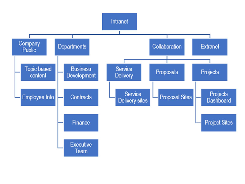
3. Creating a Sitemap
Creating a sitemap is the next step in intranet information architecture design. A sitemap visually represents the intranet's content and structure, showing how pages are organized and linked. It provides a clear overview of the intranet's content and can help identify potential issues with navigation and organization.
4. Designing Navigation Menus
Finally, designing navigation menus is a crucial step in intranet information architecture design. Navigation menus should be intuitive, consistent, and accessible, allowing users to move through the intranet easily.
Designers should consider the taxonomy, user needs, and device capabilities when designing navigation menus, ensuring that they are simple and easy to use.
Best Practices for Intranet Information Architecture
1. Conduct User Research
The first step in designing an effective intranet information architecture for intranets is to conduct user research. This involves identifying the user's needs, goals, and behaviors and using this information to inform the design of the IA.
2.Design for Findability
Findability is the ability of users to find the information they need quickly and easily. Designing for findability means ensuring that content is organized and labeled in a logical and consistent manner, making it easy for users to locate.
3. Keep it Simple
A simple intranet information architecture is often the most effective. Avoid overcomplicating the navigation, taxonomy, and content organization, as this can confuse and frustrate users. Keep the design simple and intuitive, using clear labels and logical groupings.
4. Test and Iterate
Testing the intranet information architecture with users is an essential part of the design process. This allows designers to identify areas for improvement and make changes to the intranet information architecture based on user feedback. Iterate on the design until it is intuitive and user-friendly.
5. Involve Stakeholders
Involving stakeholders in the intranet information architecture design process is crucial. This ensures that the intranet information architecture reflects the organization's goals and objectives and that stakeholders are invested in its success. Collaboration with stakeholders can also help to identify potential issues and opportunities.
6. Ensure Consistency
Consistency is key to an effective IA. Ensure that navigation, taxonomy, and content organization are consistent throughout the intranet, reducing confusion and making it easier for users to find what they need.
Creating an effective intranet information architecture for intranets requires a thoughtful and iterative approach that considers user needs, content organization, sitemap creation, and navigation menu design. By following these steps, designers can develop an intranet information architecture that supports the organization's goals while also meeting the needs of users.
Menu Design Visual Hierarchy: Tips and Techniques
Menu design is an essential aspect of website and application design, and visual hierarchy is crucial to ensure that users can quickly and easily navigate through menu options.
Visual hierarchy refers to the arrangement of menu items in a way that guides users' attention and makes it easier for them to find the content they need.
To create an effective menu design, designers must understand the importance of visual hierarchy and use techniques that enhance it.
Importance of Visual Hierarchy in Menu Design
Visual hierarchy is essential in menu design because it helps users navigate through content more efficiently. By emphasizing important menu items and grouping related options, visual hierarchy guides users' attention and makes it easier for them to find the content they need.
A well-designed menu with a clear visual hierarchy also creates a more aesthetically pleasing and organized user interface.
Techniques for Creating Visual Hierarchy
There are several techniques that designers can use to create a clear visual hierarchy in menu design:
1. Size
Using different sizes for menu items can help create a visual hierarchy. Larger items draw more attention, while smaller items recede into the background. Designers can use size to emphasize important menu items and group-related options.
2. Color
Color can also be used to create a visual hierarchy in menu design. Bright, bold colors draw attention, while muted colors recede into the background. Designers can use color to emphasize important menu items and group-related options and create a more cohesive overall design.
3. Spacing
Spacing can also be used to create a visual hierarchy in menu design. More space between menu items can help to create visual separation and draw attention to important options. Designers can use spacing to group related options and make it easier for users to distinguish between different menu items.
4. Typography
Typography can also be used to create a visual hierarchy in menu design. Different fonts, sizes, and weights can help emphasize important menu items and group-related options. Designers can use typography to create a more visually interesting and engaging menu design.
Examples of Good Visual Hierarchy in Menu Design
Examples of good visual hierarchy in menu design include websites and applications that use clear and consistent design elements to guide users' attention. These designs often use techniques such as size, color, spacing, and typography to create a clear visual hierarchy and emphasize important menu items.
For example, a website may use larger fonts and bright colors for important menu items, while smaller fonts and muted colors are used for less important options.
Testing and Improving Your Intranet's Navigation Flow UX
An effective navigation flow is crucial for a successful intranet, enabling users to quickly and easily find the information they need.
To ensure that your intranet's navigation flow is effective, testing and refining it based on user feedback is essential.
This involves conducting usability testing and using card sorting and tree testing methods to gain insights into how users interact with the navigation flow.
Importance of User Testing
User testing is essential to understand how users interact with your intranet's navigation flow. It can provide valuable insights into what users find confusing or difficult, where they expect to find certain information, and how they prefer to navigate through the intranet.
By understanding user needs and preferences, designers can make informed decisions about refining the navigation flow and improving the overall user experience.
Methods for Testing Navigation Flow UX
There are several methods for testing the navigation flow UX of your intranet:
1. Usability Testing
Usability testing involves observing users as they interact with your intranet's navigation flow. This can be done through in-person or remote testing, involving tasks such as finding specific information, completing a task, or navigating the intranet. Usability testing provides valuable insights into how users interact with the intranet and can identify areas where the navigation flow may be confusing or difficult.
2. Card Sorting
Card sorting involves asking users to organize topics or pieces of content into categories that make sense to them. This can help designers understand how users perceive and categorize information and can inform the organization of the navigation flow. Card sorting can be conducted in person or remotely, and results can be analyzed to identify patterns and insights.
3. Tree Testing
Tree testing involves asking users to navigate through a simplified version of the intranet's navigation flow, focusing solely on the labels and organization of menu items. This can help designers understand how users navigate through the intranet and identify areas where the navigation flow may be confusing or difficult.
Iterating and Refining Your Intranet's Navigation Flow UX
After conducting user testing and gaining insights into how users interact with your intranet's navigation flow, it is essential to iterate and refine the design. This involves making changes based on user feedback, testing the revised design, and continuing to iterate until the navigation flow is effective and user-friendly.
Wrapping Up: Making Intranet User-Friendly With Effective Menu Hierarchy
Creating a user-friendly intranet through effective menu hierarchy design and navigation flow UX is crucial for the success of any organization. By understanding the basics of menu hierarchy design, navigation flow UX, and creating an effective information architecture, you can create an intranet that is easy to navigate and meets the needs of your users.
Choosing the right type of navigation, designing a navigation bar UX, and implementing visual hierarchy techniques are also key components to consider.
Finally, user testing and continuous iteration are essential for improving your intranet's navigation flow UX over time. Following the tips and techniques covered in this article, you can create a user-friendly intranet to help your organization achieve its goals.
Frequently Asked Questions About Menu Hierarchy Design & Navigation Flow UX For Intranets
What Is Menu Hierarchy Design and Why Is It Important for Intranets?
Menu hierarchy design is the process of organizing and structuring menus to make them user-friendly. It is important for intranets because it helps users find the information they need quickly and easily.
What Is Navigation Flow UX and Why Is It Crucial for Intranets?
Navigation flow UX is the process of guiding users through a digital product or website in a seamless and intuitive manner. It is crucial for intranets because it helps users find the information they need without getting lost or frustrated.
How Do You Create an Effective Intranet Information Architecture?
To create an effective information architecture, you need to identify user needs, organize content, create a sitemap, and design navigation menus.
What Are the Different Types of Navigation and How Do You Choose the Right One for Your Intranet?
The different types of navigation include horizontal vs vertical navigation, dropdown vs mega menus, and breadcrumbs vs tabs. You should choose the right type for your intranet based on user needs and the amount of content you have.
What Are the Key Components of a Navigation Bar UX and How Do You Design It Effectively?
The key components of a navigation bar UX include a logo, menu items, a search bar, and user tools. To design it effectively, keep it simple, make it responsive, and ensure accessibility.
What Is Visual Hierarchy in Menu Design and How Do You Implement It?
Visual hierarchy is the use of visual cues to guide users to important information. You can implement it through size, color, spacing, and typography.
Why Is User Testing Important for Improving Your Intranet's Navigation Flow UX?
User testing helps you identify usability issues and areas for improvement in your intranet's navigation flow UX.
What Are Some Techniques for Testing Navigation Flow UX?
Some techniques for testing navigation flow UX include usability testing, card sorting, and tree testing.
How Do You Iterate and Refine Your Intranet's Navigation Flow UX over Time?
You can iterate and refine your intranet's navigation flow UX over time by analyzing user feedback and making incremental improvements.
What Are Some Tips for Creating a User-Friendly Intranet Using Menu Hierarchy Design and Navigation Flow UX?
Some tips for creating a user-friendly intranet include understanding user needs, keeping the menu simple and consistent, and making sure the navigation is intuitive and easy to use.
Most Popular Posts

Effective communication among team members is vital for the productivity and success of any organization. Surprisingly, 60% of companies lack a long-term internal communication strategy, which p...


Businesses thrive on communication for efficiency, productivity and accomplishment. When the right information is passed from the right designation in the organization, it promotes positivity an...
Categories
Blog
(3012)
Business Management
(380)
Employee Engagement
(225)
Digital Transformation
(194)
Growth
(143)
Intranets
(137)
Remote Work
(63)
Sales
(53)
Collaboration
(48)
Customer Experience
(30)
Culture
(30)
Project management
(29)
Knowledge Management
(28)
Leadership
(20)
Comparisons
(9)
News
(1)

Related Posts

Generative AI has rapidly moved from trend to transformative force, reshaping industries across the board. But perhaps its most visible impact has been in the marketing world—streamlining everything from ad creation to email copywriting in seco...

Many businesses still rely on software that was built 10, 15, or even 20 years ago. At first glance, these systems may seem cost-effective because they are already paid for and deeply embedded into daily operations. However, beneath the s...
")
Artificial intelligence is everywhere right now. From employee communication platforms and HR software to project management tools and company knowledge bases, businesses are racing to add AI to their workplace technology stack. The promise is ...

Launching a startup is exciting, but it can also be expensive if you build the wrong product. That's why many founders choose to start with a Minimum Viable Product (MVP) before committing significant time and money to full-scale development. A...

Walk into almost any workplace today and you'll find employees juggling a growing number of tools. One platform for chat, another for project management, a separate HR system, multiple document repositories, and countless email chains just to g...


Jill Romford
I am a digital nomad, lover of exploring new places and making friends.
I love to travel and I love the internet. I take pictures of my travels and share them on the internet using Instagram.
Traveler, entrepreneur, and community builder. I share my insights on digital marketing and social media while inspiring you to live your fullest life.
Ready to learn more? 👍
One platform to optimize, manage and track all of your teams. Your new digital workplace is a click away. 🚀
Free for 14 days, no credit card required.