Insight Blog
Agility’s perspectives on transforming the employee's experience throughout remote transformation using connected enterprise tools.
6 minutes reading time
(1282 words)
7 Tips for Designing a Sale-Generating Product Page (+Examples)
Here, we will examine seven tips for ensuring you put generating sales front and center and help your products shine.
The ultimate goal of every product page is, rather obviously, to sell as many products as possible. If you are already doing your best to bring more sales to your website, you might now want to examine how you display and describe your products, as well as which elements might be missing from your product pages.
Here, we will examine seven tips for ensuring you put generating sales front and center and help your products shine.
Provide Expert Advice
Customers will often have questions about your product. Even if you write the best product descriptions conceivable, there will always be something left unsaid. Most commonly, customers will want to know if a specific product will work for their specific case, which is not something you can preempt.
The best way to deal with this inevitable challenge is to make it very easy for your customers to get access to personalized, expert advice. You will already have placed your contact details in the footer or header of your website. But if you provide an expert contact form on your product pages, the effect will be quite different.
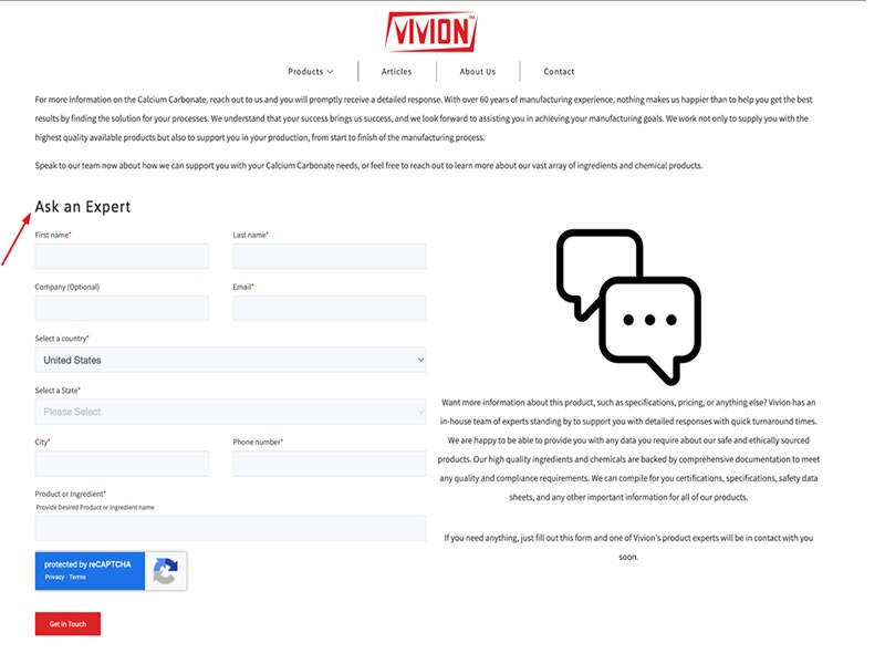
Check out this bulk calcium carbonate page. They have a "Ask an Expert" section that encourages shoppers to get in touch and learn everything they need about the product. Since the product in question also isn't everything you buy every day, this simple element is a great conversion-boosting tool.
Answer Most Common Questions
Speaking of customer questions, let's look at the best way to preempt what you can and make sure visitors don't have to reach out to find the most basic information about a product or your service.
Ask yourself what the most common conversion obstacles might be for your shoppers.
They usually involve:
- The price
- The quality of the product
- The shipping cost
- The returns policy
If any of the above is unclear, customers will have a harder time choosing to convert. If you are able to be laser precise about the cost of shipping, your returns policy, any guarantees or certificates you may have, and prove your products work, you will have done everything you can.
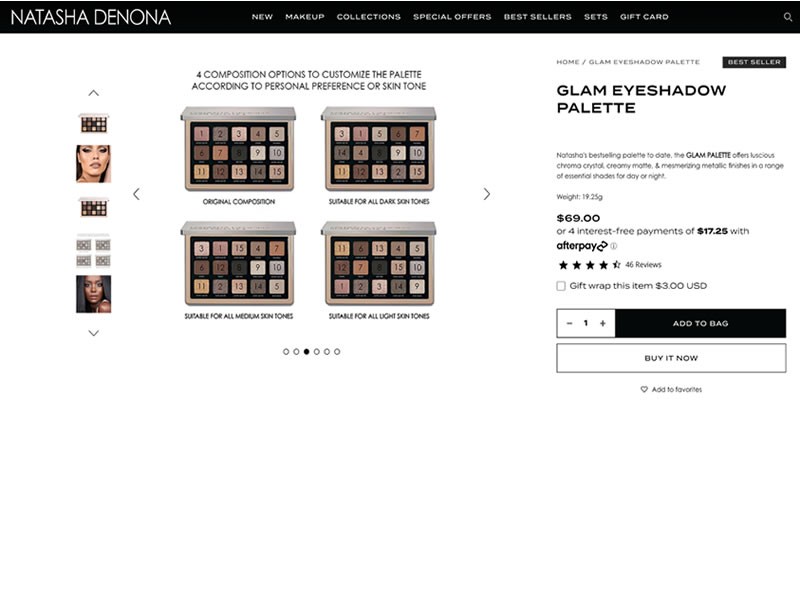
Look at Natasha Denona. All of her product pages have the same elements: what the product does, a description of the shades, a list of ingredients, and details about shipping and returns.
This is enough to tell a customer everything they need to know, and they are ready to convert (if the product is what they're looking for).
Incorporate Videos
Videos are a great way to improve the conversion rates of any product page. Depending on the nature of the product, you can film 360-degree views of the product; you can show customers how to assemble it, what it looks like in different lighting, or compare its size relative to other familiar items.
Note that not all visitors will watch the video, so it should serve to enhance the rest of your product page and not be the main conversion-driving element.
This medical alert device sales page from Bay Alarm Medical features two compelling videos. One of them shows you the product and discusses its importance and how it can change and save lives. The other demonstrates the quality of the service associated with the product, with real-life examples of customer emergencies.
Both of these videos clearly spell out what the product does, its benefits, and what you can expect to get.
Show Reviews on Product Collections Pages
Your product collections pages are just as important as individual product pages, as they are much more likely to be seen by a customer.
Most people will land on your homepage first and then browse a collection until they find a product that catches their eye. If the experience on these pages is poor, if they have trouble finding and filtering products, or if they have no compelling reason to explore further, they are likely to bounce.
A great tactic to employ is to show product reviews on your collections pages. They will signal to your customers that your products are of good quality and that you have regular customers who have already taken the time to share their thoughts about a purchase.
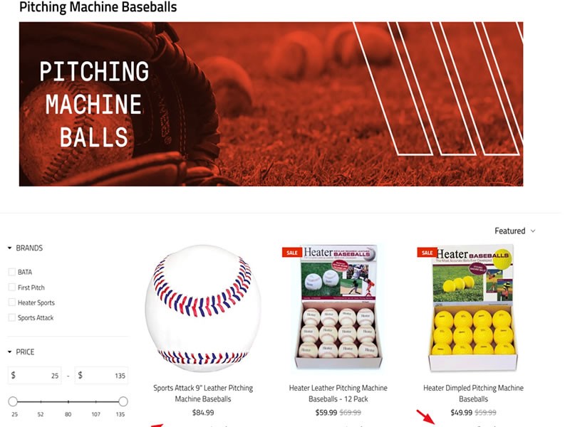
Look at this pitching machine balls collections page. It shows you the star ratings for each product and the number of reviews. Notice how it's well-organized and puts the products front and center. It's very easy to browse, and while there is a lot of information about each product, it's not cluttered or confusing.
Provide a Quick View
Speaking of product collections pages, another tactic to consider is providing a quick view option for each product. This will save shoppers time, as they won't have to open an entirely new page for each product, and they can just keep browsing.
Shop Solar Kits did a great job with their solar generator kits collections page. You can check out every product in a matter of milliseconds, you get all the key information without being overwhelmed by the full power of the actual product page, and you can choose only to look at products you are interested in.
Keep the quick view truly quick, and limit it only to the most important information.Keep Your Product Descriptions Short
Your product descriptions should also be kept as short as possible. Don't write essays about each product trying to add as many various keywords to the page as possible. Customers will quickly bounce if they have to read through mountains of information.
Provide the main facts, and be sure to highlight the benefits of the product and specifically who it is for.
Glossier is really good at applying this principle. Their Boy Brow product description, for example, tells you what kind of effect you will achieve, who can wear it, and why you should try it: it's not messy, it lasts for a long time, it blends in and is easy to apply.
This is everything a customer will really need to convert.
If your product is very complex, you want to add another section to your page that will provide more detail but keep the description above the fold simple still.
Recommend Additional Products
Finally, in order to generate more sales, make sure to suggest additional products to your customers. You can offer complementary items or similar ones from the same category. Just make sure the recommendations are logical and likely to interest the shopper.
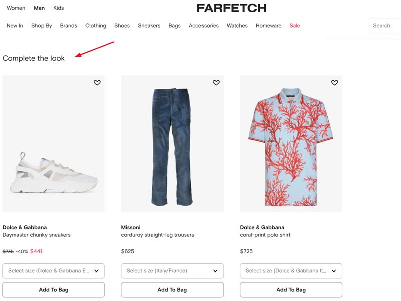
Farfetch does a great job by suggesting items to complete your look (for example, shoes and pants to go with the shirt you are looking at), and they also show you the same item in other styles and colors. These recommendations are a great way to get more clicks and pages per visit, and they help customers find just the product they were looking for.
The more personalized you are able to get with the use of cookies, the better user experience you can provide.
Wrapping up
With the help of these tips, you can ensure your product pages generate more sales and improve the trust your customers feel toward your brand. Before you implement any of them, make sure to carefully consider what your shoppers want to see and what the best way to present your items will be.
Categories
Blog
(2871)
Business Management
(354)
Employee Engagement
(219)
Digital Transformation
(189)
Growth
(138)
Intranets
(130)
Remote Work
(63)
Sales
(51)
Collaboration
(44)
Culture
(29)
Project management
(29)
Customer Experience
(28)
Knowledge Management
(25)
Leadership
(20)
Comparisons
(9)
News
(1)
Ready to learn more? 👍
One platform to optimize, manage and track all of your teams. Your new digital workplace is a click away. 🚀
Free for 14 days, no credit card required.


