
Insight Blog
Agility’s perspectives on transforming the employee's experience throughout remote transformation using connected enterprise tools.
8 minutes reading time
(1683 words)
9 Tips for Choosing the Best Visuals for Your Product Pages (+Examples)

9 Tips for Choosing the Best Visuals for Your Product Pages (+Examples)
Here are our top 9 pieces of advice, plus an example to illustrate each of them.
9 Tips for Choosing the Best Visuals for Your Product Pages (+Examples)

The visuals on a product page are arguably its most important element. Customers will want to see what they are buying. They will want to see the item from as many angles and as close up as possible.
But other than the obvious "choose high-quality visuals" tip, what else should you be mindful of? Here are our top 9 pieces of advice, plus an example to illustrate each of them.
Add the Fine Print
If you sell any kind of food or drink, supplements, private label cosmetics, or any similar item that comes with a precise ingredient list or other relevant information, make sure to include it in image format.
Most websites will include this information as a part of the product description. However, not all shoppers will have the patience to read it. If you make it a part of the image carousel, they are much more likely to notice. Consequently, they are much more likely to choose the right product for their needs.
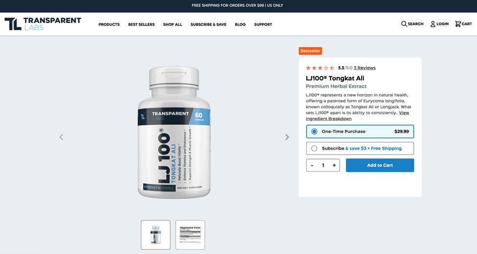
Check out this LJ100® Tongkat Ali product page. It features an image with all the relevant facts about the supplement, like serving size and servings per packaging.
Add the Fine Print
This allows the customer to weigh the price per serving and to decide whether or not they want a subscription and how often they should get a new bottle.
Showcase the Benefits
As you now know, product page visuals are a great place to showcase everything you want the customer to read. A visual representation of facts will always catch their attention more easily than bullet points or charts.
By adding a simple "product benefits" slide to your image carousel, you will again ensure customers are able to choose the best products for their needs. This will make them more satisfied and more likely to come back. They are also more likely to leave a positive review.
For example, the BioToxin Binder page on Digestive Warrior features the obvious product image. This is realistically the only image necessary, as you don't need to show the pills themselves. However, the brand has cleverly thought to add an ingredients image, a benefits image, as well as the fine print.
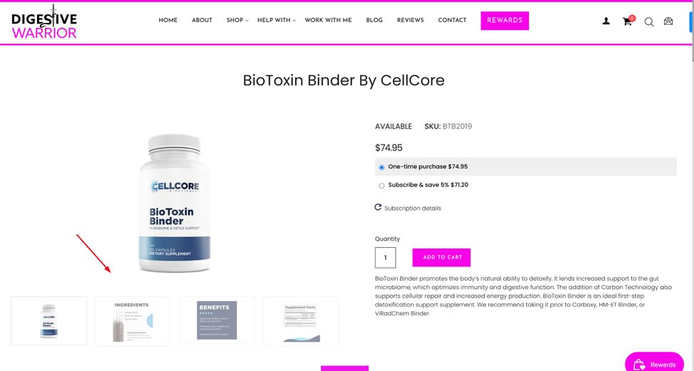
Make sure to keep the text on these images fairly short. You should also incorporate this information on the page itself, where it will be searchable.
Include a Demo Video
Most product pages can benefit from having a product demo video. Even if you're selling a simple mug, it can be good to create a very short clip of the different patterns and styles and to show the mug in use for size reference.
The more complex your product, the more impactful the demo will be. If you sell something that people don't purchase every day or an item that may come with complicated instructions, accompanying it with a video can significantly increase conversion rates.
Take a look at this medical alert systems page on GetSafe. This is certainly not an item most customers will be familiar with. The brand has shot a short video that shows the product, explains how it works, and highlights all of its benefits.

All of this information is also featured in written format on the page, so it's easily searchable and helps the page rank.
Follow us and access great exclusive content everyday: Follow us on Google News
Include Measurements
One of the most challenging aspects of online shopping is never knowing how big or small an item is. Even when it's shown next to an everyday item, it can be quite difficult to properly gauge size sometimes.
Size will matter more for some items than others. For example, a piece of furniture should always be accompanied by precise measurements. The same rule applies to clothing.
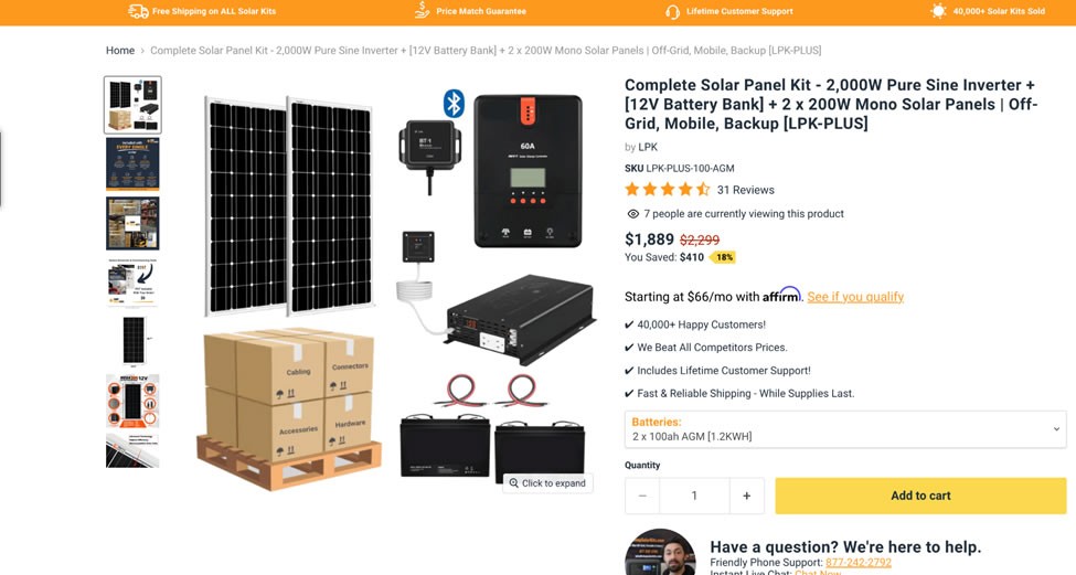
Certain tech items can also benefit from an image that shows their precise measurements. The solar power kit page on ShopSolar, for example, tells you exactly what the size of the panel in the kit is. This can help customers decide whether or not they can fit it on their roof.
It's easiest to show measurements visually, as people won't have to wonder whether height, width, or length comes first.
Make It Zoomable
All product images should be easily zoomable. This goes for very simple products, like the aforementioned mug, and it's especially important for all products that have any kind of detailing or texture.
Since the customer won't be able to touch and feel the product, it's your job to approximate the benefits of in-store shopping as well as you can. A highly zoomable image does the trick, as shoppers will be able to explore the tiniest details.
Make sure the zoom works well on a mobile screen, too. Some websites don't bother considering basic thumb behavior and force their website visitors to repeatedly click on an image to zoom in and out of its different areas.
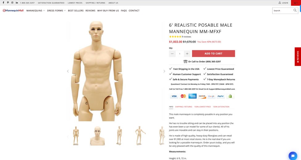
The male mannequin page on Mannequin Mall has a good zoom feature that shows the product from up close without zooming in too much. It's easy to use on all types of screens, too, which adds extra UX points.
You may also like: Best Apps for Employees: UPDATED 2022 – A Complete Guide
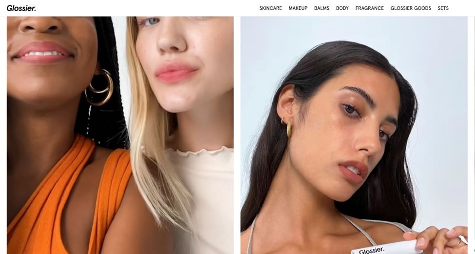
Be Diverse
One of the best ways to boost conversion rates is to help website visitors see themselves using your product. This means using a diverse group of models in your images, who will make customers feel both more at ease and more appreciated.
This is especially important if you sell any item made for use on the person, like makeup or clothing. Customers with all kinds of skin tones need to be able to imagine what the color will look like on them. If you feature only one kind of model, be they light or dark, you will instantly prevent everyone else from realistically assessing the fit of the item; using an AI image generator can help you create diverse representations that appeal to a wider audience.
Glossier is an incredibly inclusive brand, and their product photos reflect this. Take a look at their Generation G product page. They feature a variety of models wearing various shades, and they even go the extra mile and tell you what their names are. This makes it not only easier to choose the right shade but easier to feel a part of the brand's family.
Focus on the Product
While it is incredibly important to feature a diverse set of models on your product pages, it is also important not to let the models outshine the items.
A lot of female shoppers purchase items only because they look great on the model. The images are so striking and the women so gorgeous that customers forget that they look nothing like them. They end up buying something they later have to return and are dissatisfied with the experience.
Instead of shining a light on your stunning models, cut your images so that the focus is on the product itself. FarFetch does a magnificent job at this. Check out this padded parka page, for example. While they do show you what it looks like on a model, they don't show you the model's face. They make their models look like mannequins, letting the product shine.
Of course, this won't be possible for all types of products, but with a bit of creativity, you can highlight the product. This tactic will not work if you are selling a lifestyle, though. In that case, the models will be an important part of your marketing campaigns.
Free ebook: How To Get Your Intranet Off The Ground
Evoke Emotions
You will also want your images to evoke a positive emotional response. You can make your customers feel cozy, warm, and safe. You can make them smile or laugh. The point is to have them connect with the product and your brand.
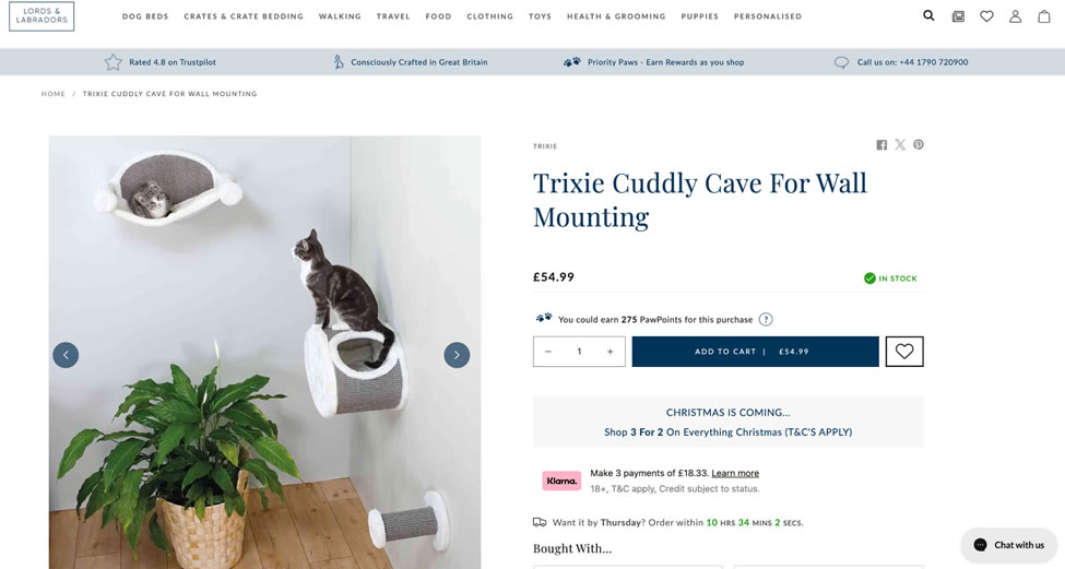
Depending on the nature of the product, you can achieve said emotional response by featuring children and animals in your visuals. This cat cave product page obviously comes with a cat, which makes the photos not only more vibrant but much more appealing.
Evoke Emotions
You can also place your models in certain situations: happy, excited, and glad to be using the product.
If there are no people in the photos or videos, use colors and props to tell your stories. For example, you can evoke a cozy vibe by using candles and warm and soft fabrics.
Play with the Senses
Finally, don't forget just how powerful images can be. A photo of a delicious cheesecake can make someone want to go out and get one right away. A photo of sandy beaches will get people daydreaming about their next vacation.
Additionally, embracing advanced tools that utilize artificial intelligence for tasks like removing objects from photos can elevate the visual appeal of your images, creating a more enticing and immersive experience for your audience.
Use your visuals to speak to your customers' senses. As an example, check out Touchland's power mist page in the Beach Coco scent.
The coconuts and clementines make you practically taste the scent. All of their products are accompanied by similar images, which are not only meant to illustrate the scent but make you crave it.
Think of the emotions and sensual experiences you want to evoke in your shoppers. How can you use images and video to achieve them?
Wrapping up
Consider these tips when choosing the visuals for your product pages. Even if you have already implemented some of them, there are probably clothes that you can also add and make your website even more appealing to your target audience.
Most Popular Posts

Effective communication among team members is vital for the productivity and success of any organization. Surprisingly, 60% of companies lack a long-term internal communication strategy, which p...


Businesses thrive on communication for efficiency, productivity and accomplishment. When the right information is passed from the right designation in the organization, it promotes positivity an...
Categories
Blog
(3024)
Business Management
(382)
Employee Engagement
(225)
Digital Transformation
(195)
Growth
(144)
Intranets
(137)
Remote Work
(63)
Sales
(53)
Collaboration
(48)
Customer Experience
(31)
Culture
(30)
Project management
(29)
Knowledge Management
(28)
Leadership
(20)
Comparisons
(9)
News
(1)

Related Posts

If you'd asked me a few years ago what AI could actually do, I'd probably have said, "Answer questions and write a few paragraphs." That was impressive at the time, but it didn't take long before everything changed. Then AI stopped being just a...

Have you ever wondered how many customer messages your business is missing simply because nobody knows who's supposed to reply? If your team is juggling Facebook, Instagram, LinkedIn, X, and other social channels, you're not alone. Social...

Have you ever finished a busy workday only to realize half your time was spent searching for information, chasing updates, or wondering if someone had already completed the task? If that sounds familiar, you're not alone. The biggest challenge ...

Healthcare digital transformation has changed the way hospitals, clinics, and healthcare providers deliver care. From electronic health records and telehealth to AI-powered diagnostics and connected medical devices, healthcare organizations are...

Every business makes investment decisions, but not every business makes good investment decisions. The difference often comes down to one thing—Data-Driven Finance. For years, companies relied on experience, gut instinct, and historical financial rep...


Jill Romford
I am a digital nomad, lover of exploring new places and making friends.
I love to travel and I love the internet. I take pictures of my travels and share them on the internet using Instagram.
Traveler, entrepreneur, and community builder. I share my insights on digital marketing and social media while inspiring you to live your fullest life.
Ready to learn more? 👍
One platform to optimize, manage and track all of your teams. Your new digital workplace is a click away. 🚀
Free for 14 days, no credit card required.